In Part 1 of this series, I showed you how to start adding WordPress Customizer functionality to your theme (or plugin). As well as showing how to add Panels & Sections, I also walked through the process of creating the individual Settings and UI Controls, sanitizing your data, updating the live preview and retrieving your settings. In Part 2 we're going to look at creating Customizer Custom Controls.
As we saw in Part 1, there are several different types of basic Core Controls that are ready to use straight-out-of-the-box. These include text, checkbox, textarea, radio, select and dropdown-pages controls. Later versions of WordPress also introduced Color, Media, Image and Cropped Image controls. If you want any other type of control, such as Sliders, On/Off Switches or Repeaters, for example, it's up to you to develop them yourself.
Developing Custom Controls
If none of the basic core controls suit your needs, you can create and add your own custom controls. Custom Controls, Sections, and Panels can be created by subclassing the PHP objects associated with each Customizer object: WP_Customize_Control, WP_Customize_Section, and WP_Customize_Panel.
Subclassing the base control class allows you to override any functionality with your own custom functionality. The most common function to override is render_content(), which allows you to specify your own custom UI with HTML. Overriding the enqueue() function also allows you to enqueue your own css and JavaScript files.
1. Registering Customizer Custom Control Content
In Part 1 of this series we learned how to go about registering our Customizer content. To do this, we simply need to create a function that is used by the customize_register action hook.
Example
/**
 * Add our Customizer content
 */
function mytheme_customize_register( $wp_customize ) {
	// Add all your Customizer content (i.e. Panels, Sections, Settings & Controls) here...
}
add_action( 'customize_register', 'mytheme_customize_register' );
When creating Custom Controls, there's also another way we can register our content. You can simply check for the existence of the WP_Customize_Control class.
/**
 * Add our Customizer content
 */
if ( class_exists( 'WP_Customize_Control' ) ) {
	// Add all your Customizer Custom Control classes here...
}
2. Creating our Custom Control Class
As mentioned above, to create our Custom Control we need to extend the WP_Customize_Control class. Once this is done, we then display our own html content for the control by overriding the render_content() function.
To show example of how to create a Custom Control, let's create a simple notice control. All this control is going to do is allow you to display a heading label and some text.

/**
 * Simple Notice Custom Control
 */
class Skyrocket_Simple_Notice_Custom_Control extends WP_Customize_Control {
	/**
	 * The type of control being rendered
	 */
	public $type = 'simple_notice';
	/**
	 * Render the control in the customizer
	 */
	public function render_content() {
	?>
	<div class="simple-notice-custom-control"></div>
		<?php if( !empty( $this->label ) ) { ?>
			<span class="customize-control-title"><?php echo esc_html( $this->label ); ?></span>
		<?php } ?>
		<?php if( !empty( $this->description ) ) { ?>
			<span class="customize-control-description"><?php echo wp_kses_post( $this->description ); ?></span>
		<?php } ?>
	</div>
	<?php
	}
}
As can be seen above, we simply override the render_content() function to display our new html. In this case, it's displaying a label and a description. We're also defining our control type using the $type variable.
Don't forget, this code needs to be placed in one of the (two) places mentioned above in Registering Customizer Custom Control Content.
This Custom Control above is obviously very basic, for the sake of the example, and in fact, it doesn't even let you save anything. All it's doing is displaying some text. Most Custom Controls, like the core Controls, would typically allow you to save a value of some sort. This means that they'd typically have some type of UI component such as a slider, checkbox or something similar.
In the example control above, you can see that I've used $this->label when displaying the label for the control, and $this->description when displaying the description. These are the arguments that were specified when using add_control().
When creating your html for displaying the control in the render_content() function there are a number of other varaiables & methods that can, and should, be used when rendering your ui component. You can use $this->id to get the id for the control and $this->value() will get the default value. Probably the most important one though, is $this->link(), which outputs information for the customizer script. More specifically, it will create a “data-customizer-setting-link” attribute which links the control to the proper setting. You can see better examples of how these variables & methods are used in the example code I'll be linking to at the bottom of this post.
More than likely, your Custom Control is also going to need some custom css and/or Javascript. You can enqueue these scripts by overriding the enqueue() function.
Example
/**
 * Sample Custom Control
 */
class My_Awesome_Custom_Control extends WP_Customize_Control {
	/**
	 * The type of control being rendered
	 */
	public $type = 'sample_custom_control';

	/**
	 * Enqueue our scripts and styles
	 */
	public function enqueue() {
		// Enqueue our scripts here...
	}

	/**
	 * Render the control in the customizer
	 */
	public function render_content() {
		// Render our control HTML here...
	}
}
3. Using our New Custom Control
Now that our Custom Control has been created, it's a simple matter of using our new control in the same way that we'd use one of the default built-in controls.
First up we need to add our setting, and after that, add our control. The only difference you'll notice is that when we add our control we have to specify our new class that we created for our control.
Just like any other control, we also define our label and description that we want to display in the Customizer.
// Test of Sample Custom Control
$wp_customize->add_setting( 'sample_custom_control',
	array(
		'default' => '',
		'transport' => 'refresh',
		'sanitize_callback' => 'wp_filter_nohtml_kses'
	)
);
$wp_customize->add_control( new My_Awesome_Custom_Control( $wp_customize, 'sample_custom_control',
	array(
		'label' => __( 'Sample Custom Control' ),
		'description' 	=> esc_html__( 'This is the Custom Control description.' ),
		'section' => 'sample_custom_controls_section'
	)
) );
To use the setting for our new control in our theme, we use the get_theme_mod() function, just like we would for any other control. You can learn more about this in Retrieving Cutomizer Settings in Part 1.
4. Triggering Changes for your Control
When I started creating more complex controls, such as my Sortable Repeater, one of the issues I encountered is that when I changed the content in my control in the Customizer, the Save button at the top of the Customizer wouldn't enable and therefore I couldn't save my changes. This will most likely happen when you start using jQuery to dynamically alter the content of your control.
In my Sortable Repeater control, you can add a new input field by clicking the Add button. You can also drag and drop the fields to rearange their order. In the background, my jQuery script was simply getting the content of all the input fields, creating a comma separated string of all the content, and adding it to a (hidden) input field. It's the content in this hidden input field that actually gets saved to the database.
The problem I was finding though was that when I did this, my Save button wasn't getting enabled which meant that I couldn't save my data. The solution, which took me ages to find, was that I needed to trigger a change event in my jQuery script. This would instruct the Customizer that the field has changed which in turn would enable the Save button.
Example
// Important! Make sure to trigger change event so Customizer knows it has to save the field
url.val('https://' + val).trigger('change');
5. Custom Controls
To help with your Customizer development, I've created a number of Custom Controls that you can use in your own theme or plugin. Over on my Github repo, you'll find all the code for these Custom Controls, along with demo code for implementing these and all the core controls, in your theme.
The new Custom Controls that I've created are listed below. So as not to make this post incredibly long, I'm not going to list the PHP and jQuery for each control. Instead, I recommend you take a look at the Github repo if you're interested in learning more about how these controls work.
For easy reference, the new Custom Controls outlined in this post are:
Toggle Switch
Slider
Sortable Repeater
Image Radio Button
Text Radio Button
Image Checkbox
Single Accordion
Simple Notice
Dropdown Select2
Dropdown Posts
TinyMCE Editor
Google Font Select
Alpha Color Picker
WPColorPicker Alpha Color Picker
Sortable Pill Checkbox
Divider
Upsell Section
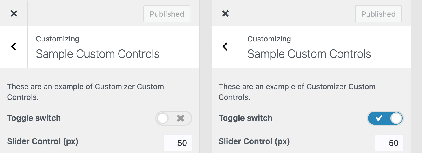
5.1 Toggle Switch
The Toggle Switch Custom Control is basically just a fancy type of checkbox. It allows for two states, either off or on.
Usage
add_control( $id, $args );
Parameters
$id – (string) (required) Customize Control object or ID of the Setting associated with this Control. Default: None
$args – (array) (optional) An associative array containing arguments for the setting. Default: empty array
Arguments for $args
label – Optional. The label that will be displayed. Default: Blank
section – Required. The Section where there control should appear
Example
$wp_customize->add_setting( 'sample_toggle_switch',
	array(
		'default' => 0,
		'transport' => 'refresh',
		'sanitize_callback' => 'skyrocket_switch_sanitization'
	)
);

$wp_customize->add_control( new Skyrocket_Toggle_Switch_Custom_control( $wp_customize, 'sample_toggle_switch',
	array(
		'label' => esc_html__( 'Toggle switch' ),
		'section' => 'sample_custom_controls_section'
	)
) );
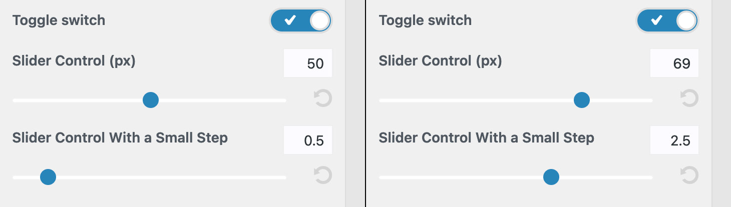
5.2 Slider
The Slider Custom Control allows you to drag a handle across a horizontal bar to increase or decrease a numeric value. The control also has a reset button, allowing you to reset the value back to the default value. The accompanying input field shows you the value of the slider whilst also giving you the ability to manually enter a value as well.
You can specify the minimum and maximum values for the slider as well as the step size, which is the size of each interval between the minimum and maximum values.
The Slider Custom Control also allows you to specify a list of units, which is useful for controls where you need to specify units like px, em or rem (e.g. when slecting font sizes)
Usage
add_control( $id, $args );
Parameters
$id – (string) (required) Customize Control object or ID of the Setting associated with this Control. Default: None
$args – (array) (optional) An associative array containing arguments for the setting. Default: empty array
Arguments for $args
label – Optional. The label that will be displayed Default: Blank
section – Required. The Section where there control should appear
input_attrs – Required. List of custom input attributes for control output.
min – Required. Minimum value for the slider
max – Required. Maximum value for the slider
step – Required. The size of each interval or step the slider takes between the min and max values
default_unit – Optional. Default unit to use when displaying units
units – Optional. Array containing list of options to display for the units
key – Required. Data that will be stored for the setting
value – Required. Data that is displayed in the dropdown list
Example
$wp_customize->add_setting( 'sample_slider_control',
	array(
		'default' => 48,
		'transport' => 'postMessage',
		'sanitize_callback' => 'skyrocket_sanitize_integer'
	)
);

$wp_customize->add_control( new Skyrocket_Slider_Custom_Control( $wp_customize, 'sample_slider_control',
	array(
		'label' => esc_html__( 'Slider Control (px)' ),
		'section' => 'sample_custom_controls_section',
		'input_attrs' => array(
			'min' => 10, // Required. Minimum value for the slider
			'max' => 90, // Required. Maximum value for the slider
			'step' => 1, // Required. The size of each interval or step the slider takes between the minimum and maximum values
		),
	)
) );

$wp_customize->add_setting( 'sample_slider_control_with_units',
	array(
		'default' => "24px",
		'transport' => 'refresh',
		'sanitize_callback' => 'skyrocket_range_sanitization'
	)
);
$wp_customize->add_control( new Skyrocket_Slider_Custom_Control( $wp_customize, 'sample_slider_control_with_units',
	array(
		'label' => __( 'Font Size', 'skyrocket' ),
		'section' => 'sample_custom_controls_section',
		'input_attrs' => array(
			'min' => 10,
			'max' => 60,
			'step' => 1,
			'default_unit' => 'px', // Optional. Default unit to use
			'units' => array( // Optional. List of units available for selection
				'px' => ( 'px' ),
				'em' => ( 'em' ),
				'rem' => ( 'rem' ),
				'vw' => ( 'vw' ),
			),
		),
	)
) );
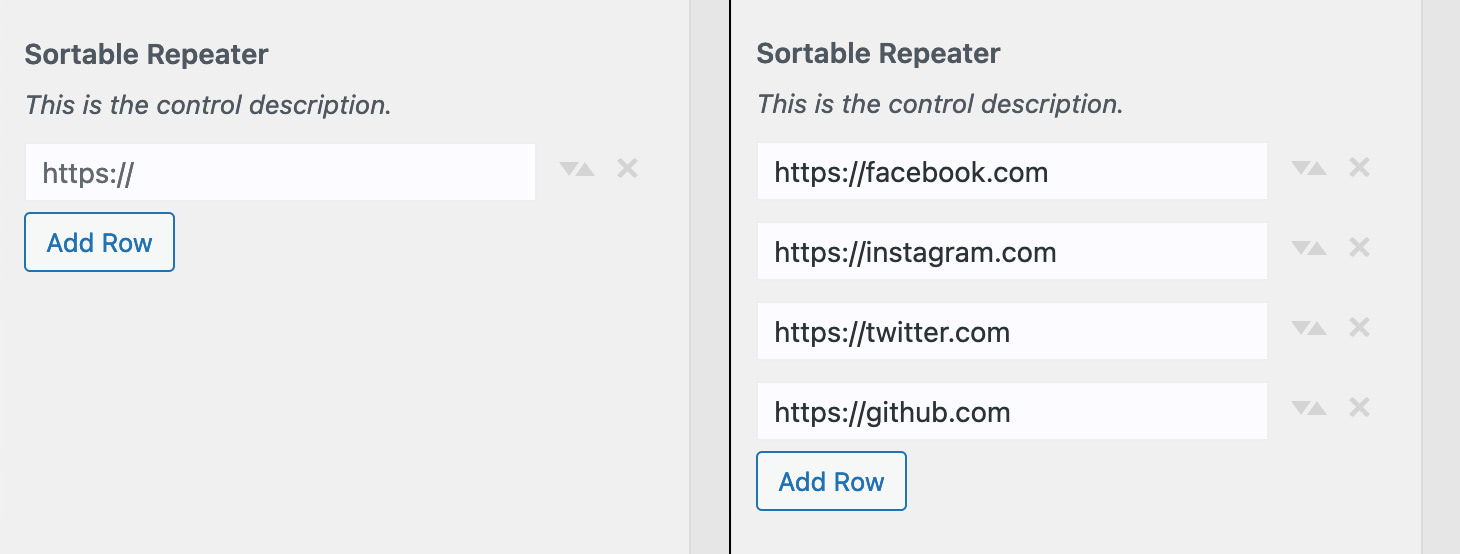
5.3 Sortable Repeater
The Sortable Repeater Custom Control allows you to collect values from one or more input fields. On top of that, the fields can be reordered by simply dragging ‘n dropping each field. The control provides an icon handle for easy drag ‘n drop reordering, a button for deleting a row and a button for adding a new row.
This particular Control has been designed for collecting one or more URL's and will validate the fields as such. It will also automatically add https:// to any url if it is missing. If you want to collect other type of data, such as plain text, simply duplicate this control and modify as necessary.
The setting for this control will be saved as a comma delimited string of URL's. To use this setting in your theme, I recommend using the PHP explode() function to convert the comma delimited string to an array of strings.
Usage
add_control( $id, $args );
Parameters
$id – (string) (required) Customize Control object or ID of the Setting associated with this Control. Default: None
$args – (array) (optional) An associative array containing arguments for the setting. Default: empty array
Arguments for $args
label – Optional. The label that will be displayed Default: Blank
description – Optional. The description to display under the label. Default: Blank.
section – Required. The Section where there control should appear
button_labels – Optional. Array containing a list of labels for the control
add – Optional. Button label for add button. Default: Add
Example
$wp_customize->add_setting( 'sample_sortable_repeater_control',
	array(
		'default' => '',
		'transport' => 'refresh',
		'sanitize_callback' => 'skyrocket_url_sanitization'
	)
);

$wp_customize->add_control( new Skyrocket_Sortable_Repeater_Custom_Control( $wp_customize, 'sample_sortable_repeater_control',
	array(
		'label' => __( 'Sortable Repeater' ),
		'description' => esc_html__( 'This is the control description.' ),
		'section' => 'sample_custom_controls_section',
		'button_labels' => array(
			'add' => __( 'Add Row' ), // Optional. Button label for Add button. Default: Add
		)
	)
) );
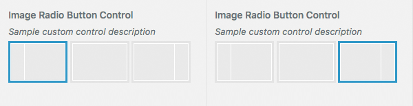
5.4 Image Radio Button
The Image Radio Button works the same as an ordinary radio button control, in that you can only choose one item out of a number of items. The difference is that it allows you to display images for each selection choice. This is useful where an image provides a better indicator for the user than simple text. A common use of this type of control is where a user might select the layout of their site.
When adding your control, you can specify the url for the image to display, the title text to display when hovering the cursor over the image and the value for each item.
Like an ordinary radio button, the setting that gets saved to the database is the key that you specify for each radio button choice.
Usage
add_control( $id, $args );
Parameters
$id – (string) (required) Customize Control object or ID of the Setting associated with this Control. Default: None
$args – (array) (optional) An associative array containing arguments for the setting. Default: empty array
Arguments for $args
label – Optional. The label that will be displayed Default: Blank
description – Optional. The description to display under the label. Default: Blank.
section – Required. The Section where there control should appear
choices – Required. List of custom choices.
key – Required. Data that will be stored for the setting
image – Required. URL for the image to display
name – Required. Title text to display
Example
$wp_customize->add_setting( 'sample_image_radio_button',
	array(
		'default' => 'sidebarright',
		'transport' => 'refresh',
		'sanitize_callback' => 'skyrocket_text_sanitization'
	)
);

$wp_customize->add_control( new Skyrocket_Image_Radio_Button_Custom_Control( $wp_customize, 'sample_image_radio_button',
	array(
		'label' => __( 'Image Radio Button Control' ),
		'description' => esc_html__( 'Sample custom control description' ),
		'section' => 'sample_custom_controls_section',
		'choices' => array(
			'sidebarleft' => array(  // Required. Setting for this particular radio button choice
				'image' => trailingslashit( get_template_directory_uri() ) . 'images/sidebar-left.png', // Required. URL for the image
				'name' => __( 'Left Sidebar' ) // Required. Title text to display
			),
			'sidebarnone' => array(
				'image' => trailingslashit( get_template_directory_uri() ) . 'images/sidebar-none.png',
				'name' => __( 'No Sidebar' )
			),
			'sidebarright' => array(
				'image' => trailingslashit( get_template_directory_uri() ) . 'images/sidebar-right.png',
				'name' => __( 'Right Sidebar' )
			)
		)
	)
) );
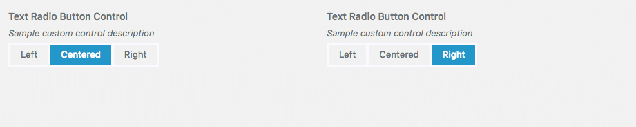
5.5 Text Radio Button
The Text Radio Button is another type of radio button, and again, works the same as an ordinary radio button control. The Text Radio Button simply displays the choices in a compact row of text.
When adding your control, you specify the text to display for each choice and the setting for each item.
Like an ordinary radio button, the setting that gets saved to the database is the value that you specify for each radio button choice.
Usage
add_control( $id, $args );
Parameters
$id – (string) (required) Customize Control object or ID of the Setting associated with this Control. Default: None
$args – (array) (optional) An associative array containing arguments for the setting. Default: empty array
Arguments for $args
label – Optional. The label that will be displayed Default: Blank
description – Optional. The description to display under the label. Default: Blank.
section – Required. The Section where there control should appear
choices – Required. List of custom choices.
key – Required. Data that will be stored for the setting
value – Required. Data that is displayed for the radio button choice
Example
$wp_customize->add_setting( 'sample_text_radio_button',
	array(
		'default' => 'right',
		'transport' => 'refresh',
		'sanitize_callback' => 'skyrocket_radio_sanitization'
	)
);

$wp_customize->add_control( new Skyrocket_Text_Radio_Button_Custom_Control( $wp_customize, 'sample_text_radio_button',
	array(
		'label' => __( 'Text Radio Button Control' ),
		'description' => esc_html__( 'Sample custom control description' ),
		'section' => 'sample_custom_controls_section',
		'choices' => array(
			'left' => __( 'Left' ), // Required. Setting for this particular radio button choice and the text to display
			'centered' => __( 'Centered' ), // Required. Setting for this particular radio button choice and the text to display
			'right' => __( 'Right' ) // Required. Setting for this particular radio button choice and the text to display
		)
	)
) );
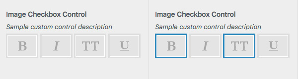
5.6 Image Checkbox
The Image Checkbox works the same as an ordinary checkbox control, in that you can select one or more items out of a number of items. The difference is that it allows you to display images for each selection choice. This is useful where an image provides a better indicator for the user than simple text. A common use of this type of control is where a user might select the weight of a font (e.g. Bold, Italic etc.).
When adding your control, you can specify the url for the image to display, the title text to display when hovering the cursor over the image and the value for each item.
The setting that gets saved to the database is a comma-separated string of values for each of the items that are selected.
Usage
add_control( $id, $args );
Parameters
$id – (string) (required) Customize Control object or ID of the Setting associated with this Control. Default: None
$args – (array) (optional) An associative array containing arguments for the setting. Default: empty array
Arguments for $args
label – Optional. The label that will be displayed Default: Blank
description – Optional. The description to display under the label. Default: Blank.
section – Required. The Section where there control should appear
choices – Required. List of custom choices.
key – Required. Data that will be stored for the setting
image – Required. URL for the image to display
name – Required. Title text to display
Example
$wp_customize->add_setting( 'sample_image_checkbox',
	array(
		'default' => 'stylebold,styleallcaps',
		'transport' => 'refresh',
		'sanitize_callback' => 'skyrocket_text_sanitization'
	)
);

$wp_customize->add_control( new Skyrocket_Image_checkbox_Custom_Control( $wp_customize, 'sample_image_checkbox',
	array(
		'label' => __( 'Image Checkbox Control' ),
		'description' => esc_html__( 'Sample custom control description' ),
		'section' => 'sample_custom_controls_section',
		'choices' => array(
			'stylebold' => array( // Required. Setting for this particular radio button choice
				'image' => trailingslashit( get_template_directory_uri() ) . 'images/Bold.png', // Required. URL for the image
				'name' => __( 'Bold' ) // Required. Title text to display
			),
			'styleitalic' => array(
				'image' => trailingslashit( get_template_directory_uri() ) . 'images/Italic.png',
				'name' => __( 'Italic' )
			),
			'styleallcaps' => array(
				'image' => trailingslashit( get_template_directory_uri() ) . 'images/AllCaps.png',
				'name' => __( 'All Caps' )
			),
			'styleunderline' => array(
				'image' => trailingslashit( get_template_directory_uri() ) . 'images/Underline.png',
				'name' => __( 'Underline' )
			)
		)
	)
) );
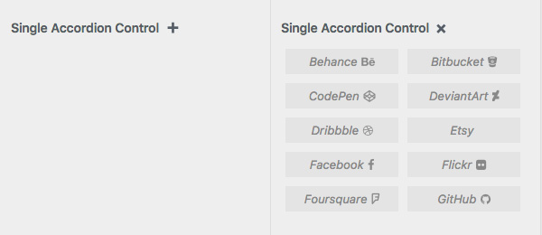
5.7 Single Accordion
The Single Accordion Control allows you to display a large block of text such as instructional information, whilst keeping it hidden or minimised until clicked. When the control is clicked, the content will become visible and when clicked again, the content will hide.
There's no settings saved for this control, it's purely for showing/hiding a block of content.
You can pass it an array of key/values pair that will get displayed as a list, or just plain text content (incl. basic html tags a, br, em, strong, i).
Usage
add_control( $id, $args );
Parameters
$id – (string) (required) Customize Control object or ID of the Setting associated with this Control. Default: None
$args – (array) (optional) An associative array containing arguments for the setting. Default: empty array
Arguments for $args
label – Optional. The label that will be displayed Default: Blank
description – Required. The text to hide under the accordion, passed as an array or string
section – Required. The Section where there control should appear
Example
// Example 1
$sampleIconsList = array(
	'Behance' => __( '<i class="fa fa-behance"></i>', 'ephemeris' ),
	'Bitbucket' => __( '<i class="fa fa-bitbucket"></i>', 'ephemeris' ),
	'CodePen' => __( '<i class="fa fa-codepen"></i>', 'ephemeris' ),
	'DeviantArt' => __( '<i class="fa fa-deviantart"></i>', 'ephemeris' ),
	'Dribbble' => __( '<i class="fa fa-dribbble"></i>', 'ephemeris' ),
	'Etsy' => __( '<i class="fa fa-etsy"></i>', 'ephemeris' ),
	'Facebook' => __( '<i class="fa fa-facebook"></i>', 'ephemeris' ),
	'Flickr' => __( '<i class="fa fa-flickr"></i>', 'ephemeris' ),
	'Foursquare' => __( '<i class="fa fa-foursquare"></i>', 'ephemeris' ),
	'GitHub' => __( '<i class="fa fa-github"></i>', 'ephemeris' ),
);

$wp_customize->add_setting( 'sample_single_accordion',
	array(
		'default' => '',
		'transport' => 'refresh',
		'sanitize_callback' => 'skyrocket_text_sanitization'
	)
);

$wp_customize->add_control( new Skyrocket_Single_Accordion_Custom_Control( $wp_customize, 'sample_single_accordion',
	array(
		'label' => __( 'Single Accordion Control' ),
		'description' => $sampleIconsList, // Required. Passing an array of key/values pairs which are displayed in a list
		'section' => 'sample_custom_controls_section'
	)
) );

// Example 2
$wp_customize->add_setting( 'another_sample_single_accordion',
	array(
		'default' => '',
		'transport' => 'refresh',
		'sanitize_callback' => 'skyrocket_text_sanitization'
	)
);

$wp_customize->add_control( new Skyrocket_Single_Accordion_Custom_Control( $wp_customize, 'another_sample_single_accordion',
	array(
		'label' => __( 'Another Single Accordion Control' ),
		'description' => __( 'This is some simple text with an <a href="http://google.com">html link</a> included.' ),  // Required. Passing some text with some basic html content
		'section' => 'sample_custom_controls_section'
	)
) );
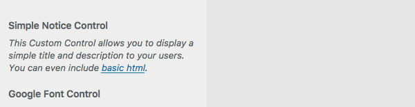
5.8 Simple Notice
The Simple Notice Control allows you to display a block of text such as instructional information. There's no settings saved for this control, it's purely for displaying a block of content.
The text content can include basic html tags such as a, br, em, strong, i, span and code.
Usage
add_control( $id, $args );
Parameters
$id – (string) (required) Customize Control object or ID of the Setting associated with this Control. Default: None
$args – (array) (optional) An associative array containing arguments for the setting. Default: empty array
Arguments for $args
label – Optional. The label that will be displayed Default: Blank
description – Required. The text to display
section – Required. The Section where there control should appear
Example
$wp_customize->add_setting( 'sample_simple_notice',
	array(
		'default' => '',
		'transport' => 'postMessage',
		'sanitize_callback' => 'skyrocket_text_sanitization'
	)
);

$wp_customize->add_control( new Skyrocket_Simple_Notice_Custom_control( $wp_customize, 'sample_simple_notice',
	array(
		'label' => __( 'Simple Notice Control' ),
		'description' => __( 'This Custom Control allows you to display a simple title and description to your users. You can even include <a href="http://google.com" target="_blank">basic html</a>.' ),
		'section' => 'sample_custom_controls_section'
	)
) );
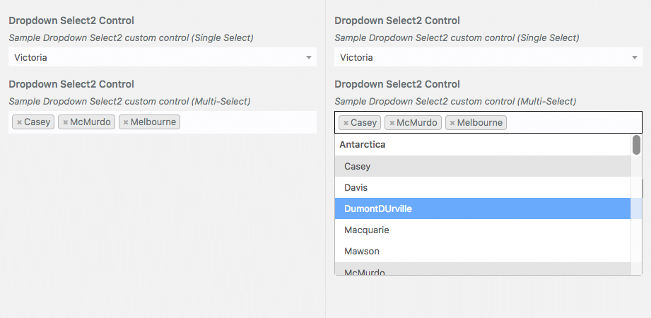
5.9 Dropdown Select2
Select2 is a jQuery based replacement for select boxes. Select2 gives you a customizable select box with support for searching, tagging, remote data sets, infinite scrolling, and many other highly used options.
The Dropdown Select2 Custom Control provides a simple way of implementing a Select2 Dropwdown in the Customizer. One of the main benefits of using this Select2 Dropdown over a regular Dropdown is that it provides a handy input field allowing you to type in and search for the item your looking for. This is really handy when your dropdown list is extremely long and scrolling through the list becomes cumbersome. An example of where you might want to use this over a regular Dropdown is when you have a list of Countries or Timezones. Basically, any Dropdown list that is more than a dozen entries would benefit from using this Select2 Custom Control over a regular Dropdown control.
One of the other benefits of this control is the ability to handle Multi-Select lists. That is, it provides you with the ability to easily select multiple entries in your list, rather than just a single entry, if you so desire. This can be achieved simply by including 'multiselect' => true in your input_attrs.
The Dropdown Select2 Custom Control handles a straight forward list of entries by passing your entries as an array using the 'choices' parameter. Alternatively, if you want your Dropdown list to show Option Groups (i.e. the ability to group your list into different sections), then you can also pass an array of arrays to 'choices'.
If you wish to select default values, pass a simple string when using the control to select a single entry. When using the control as a mutli-select, pass an array of strings to select multiple default values.
To santize your controls data, use my skyrocket_text_sanitization function or any other function that can sanitize a simple string and also a series of comma delimited strings. It's worth noting that the multiselect dropdown will either save a single string or a series of comma delimited strings, depending on the number of entries selected in the dropdown.
When only a single entry is selected, even when using the multiselect dropdown, then the setting will be saved to the database as a single string. If you are using the multiselect dropdown (i.e. 'multiselect' => true) and you've selected multiple entries, they will be saved to the database as a series of comma delimited strings.
Usage
add_control( $id, $args );
Parameters
$id – (string) (required) Customize Control object or ID of the Setting associated with this Control. Default: None
$args – (array) (optional) An associative array containing arguments for the setting. Default: empty array
Arguments for $args
label – Optional. The label that will be displayed Default: Blank
description – Required. The text to display
section – Required. The Section where there control should appe
input_attrs – Optional. List of custom choices.
placeholder – Optional. The Placeholder value to display. Select2 requires a Placeholder value to be set when using the clearall option. Default = ‘Please select…'
multiselect – Optional. Select a single entry from the dropdown or select multiple. Either true or false. Default = false
choices – Required. List of custom choices.
key – Required. Data that will be stored for the setting
value – Required. Text to display in the control
Example
// Test of Dropdown Select2 Control (single select)
$wp_customize->add_setting( 'sample_dropdown_select2_control_single',
	array(
		'default' => 'vic',
		'transport' => 'refresh',
		'sanitize_callback' => 'skyrocket_text_sanitization'
	)
);
$wp_customize->add_control( new Skyrocket_Dropdown_Select2_Custom_Control( $wp_customize, 'sample_dropdown_select2_control_single',
	array(
		'label' => __( 'Dropdown Select2 Control', 'skyrocket' ),
		'description' => esc_html__( 'Sample Dropdown Select2 custom control (Single Select)', 'skyrocket' ),
		'section' => 'sample_custom_controls_section',
		'input_attrs' => array(
			'placeholder' => __( 'Please select a state...', 'skyrocket' ),
			'multiselect' => false,
		),
		'choices' => array(
			'nsw' => __( 'New South Wales', 'skyrocket' ),
			'vic' => __( 'Victoria', 'skyrocket' ),
			'qld' => __( 'Queensland', 'skyrocket' ),
			'wa' => __( 'Western Australia', 'skyrocket' ),
			'sa' => __( 'South Australia', 'skyrocket' ),
			'tas' => __( 'Tasmania', 'skyrocket' ),
			'act' => __( 'Australian Capital Territory', 'skyrocket' ),
			'nt' => __( 'Northern Territory', 'skyrocket' ),
		)
	)
) );

// Test of Dropdown Select2 Control (Multi-Select) with Option Groups
$wp_customize->add_setting( 'sample_dropdown_select2_control_multi',
	array(
		'default' => array ( 'Antarctica/McMurdo', 'Australia/Melbourne', 'Australia/Broken_Hill' ),
		'transport' => 'refresh',
		'sanitize_callback' => 'skyrocket_array_sanitization'
	)
);
$wp_customize->add_control( new Skyrocket_Dropdown_Select2_Custom_Control( $wp_customize, 'sample_dropdown_select2_control_multi',
	array(
		'label' => __( 'Dropdown Select2 Control', 'skyrocket' ),
		'description' => esc_html__( 'Sample Dropdown Select2 custom control (Multi-Select)', 'skyrocket' ),
		'section' => 'sample_custom_controls_section',
		'input_attrs' => array(
			'multiselect' => true,
		),
		'choices' => array(
			__( 'Antarctica', 'skyrocket' ) => array(
				'Antarctica/Casey' => __( 'Casey', 'skyrocket' ),
				'Antarctica/Davis' => __( 'Davis', 'skyrocket' ),
				'Antarctica/DumontDurville' => __( 'DumontDUrville', 'skyrocket' ),
				'Antarctica/Macquarie' => __( 'Macquarie', 'skyrocket' ),
				'Antarctica/Mawson' => __( 'Mawson', 'skyrocket' ),
				'Antarctica/McMurdo' => __( 'McMurdo', 'skyrocket' ),
				'Antarctica/Palmer' => __( 'Palmer', 'skyrocket' ),
				'Antarctica/Rothera' => __( 'Rothera', 'skyrocket' ),
				'Antarctica/Syowa' => __( 'Syowa', 'skyrocket' ),
				'Antarctica/Troll' => __( 'Troll', 'skyrocket' ),
				'Antarctica/Vostok' => __( 'Vostok', 'skyrocket' ),
			),
			__( 'Atlantic', 'skyrocket' ) => array(
				'Atlantic/Azores' => __( 'Azores', 'skyrocket' ),
				'Atlantic/Bermuda' => __( 'Bermuda', 'skyrocket' ),
				'Atlantic/Canary' => __( 'Canary', 'skyrocket' ),
				'Atlantic/Cape_Verde' => __( 'Cape Verde', 'skyrocket' ),
				'Atlantic/Faroe' => __( 'Faroe', 'skyrocket' ),
				'Atlantic/Madeira' => __( 'Madeira', 'skyrocket' ),
				'Atlantic/Reykjavik' => __( 'Reykjavik', 'skyrocket' ),
				'Atlantic/South_Georgia' => __( 'South Georgia', 'skyrocket' ),
				'Atlantic/Stanley' => __( 'Stanley', 'skyrocket' ),
				'Atlantic/St_Helena' => __( 'St Helena', 'skyrocket' ),
			),
			__( 'Australia', 'skyrocket' ) => array(
				'Australia/Adelaide' => __( 'Adelaide', 'skyrocket' ),
				'Australia/Brisbane' => __( 'Brisbane', 'skyrocket' ),
				'Australia/Broken_Hill' => __( 'Broken Hill', 'skyrocket' ),
				'Australia/Currie' => __( 'Currie', 'skyrocket' ),
				'Australia/Darwin' => __( 'Darwin', 'skyrocket' ),
				'Australia/Eucla' => __( 'Eucla', 'skyrocket' ),
				'Australia/Hobart' => __( 'Hobart', 'skyrocket' ),
				'Australia/Lindeman' => __( 'Lindeman', 'skyrocket' ),
				'Australia/Lord_Howe' => __( 'Lord Howe', 'skyrocket' ),
				'Australia/Melbourne' => __( 'Melbourne', 'skyrocket' ),
				'Australia/Perth' => __( 'Perth', 'skyrocket' ),
				'Australia/Sydney' => __( 'Sydney', 'skyrocket' ),
			)
		)
	)
) );
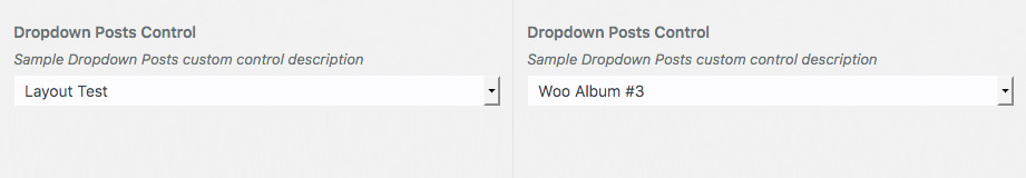
5.10 Dropdown Posts
The Dropdown Posts Custom Control allows you to display a dropdown list of your Posts. You can display all Posts or just a selection by using the input_attrs array when adding your control.
This control is extremely flexible. Not only can you display a list of your typical (blog) Posts, but it can actually show any type of Post, such as WooCommerce Products, or even Pages. You can pass an array of Post ID's to include, an array of Post IDs NOT to include, how many posts to retrieve, the Post Type (e.g. you could use product for WooCommerce products) and a long list of other options. To see the complete list of values you can pass using the input_attrs array, see WP_Query::parse_query() in the WordPress Codex.
The setting that gets saved to the database is a Post ID.
Usage
add_control( $id, $args );
Parameters
$id – (string) (required) Customize Control object or ID of the Setting associated with this Control. Default: None
$args – (array) (optional) An associative array containing arguments for the setting. Default: empty array
Arguments for $args
label – Optional. The label that will be displayed Default: Blank
description – Optional. The description to display under the label. Default: Blank.
section – Required. The Section where there control should appear
input_attrs – Optional. List of post options. The options listed below are the most common. See WP_Query::parse_query() in the WordPress Codex for the complete list.
posts_per_page – Optional. The number of posts to retrieve. Use -1 to retrieve all posts. Default: 5
orderby – Optional. Order to sort retrieved posts by. Accepts ‘none', ‘name', ‘author', ‘date', ‘title', ‘modified', ‘menu_order', ‘parent', ‘ID', ‘rand' and a number of others. Default: ‘date'
order – Optional. Designates ascending or descending order of posts. Accepts ‘ASC' or ‘DESC'. Default: ‘DESC'
cat – Optional. Category ID or comma-separated list of IDs. Default: 0
post__in – Optional. An array of post IDs to retrieve (sticky posts will be included)
post__not_in – Optional. An array of post IDs not to retrieve. Note: a string of comma- separated IDs will NOT work
post_type – Optional. A post type slug (string) or array of post type slugs. Default: ‘post'
Example
$wp_customize->add_setting( 'sample_dropdown_posts_control',
	array(
		'default' => '',
		'transport' => 'postMessage',
		'sanitize_callback' => 'absint'
	)
);
$wp_customize->add_control( new Skyrocket_Dropdown_Posts_Custom_Control( $wp_customize, 'sample_dropdown_posts_control',
	array(
		'label' => __( 'Dropdown Posts Control', 'skyrocket' ),
		'description' => esc_html__( 'Sample Dropdown Posts custom control description', 'skyrocket' ),
		'section' => 'sample_custom_controls_section',
		'input_attrs' => array(
			'posts_per_page' => -1,
			'orderby' => 'name',
			'order' => 'ASC',
		),
	)
) );
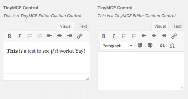
5.11 TinyMCE Editor
The TinyMCE editor works the same as the standard TinyMCE Editor that you use when creating a Page or Post. The only difference you'll notice is that it has a minimalist toolbar. This is mainly because you're not likely to need the same full-featured toolbar as you would when creating a Page or Post. It's also due, in part, to the limited screen space available in the Customizer sidebar. Like the standard Page/Post TinyMCE editor, you can add text & links, along with various styles such as bold, italics and a number of other styles.
When adding your control, you can also specify what toolbar icons you would like to display. You can have one toolbar row or two toolbar rows. If you don't specify any toolbars, the default is to display one toolbar with bold, italic, bullet list, number list, align left, align center, align right and link buttons.
The full list of available toolbar buttons is available on the official TinyMCE website. Their Examples & Demo pages also has a number of examples showing how each of the toolbar buttons would display. It's worth noting that some toolbar buttons require additional TinyMCE plugins, not all of which are available by default in the WordPress version of TinyMCE.
You can also choose to display or hide the Add Media button, enabling you to easily add images into your controls content. The Add Media button will be hidden by default.
When sanitzing your setting, you can simply use the core wp_kses_post() function, which will sanitize the content for allowed HTML tags for post content.
The setting that gets saved to the database will be a string with the allowed HTML tags and attributes intact.
Please note: The TinyMCE Editor Custom Control will only work in WordPress 4.8 and above as the JavaScript functionality required for its use was only added in WP 4.8
Usage
add_control( $id, $args );
Parameters
$id – (string) (required) Customize Control object or ID of the Setting associated with this Control. Default: None
$args – (array) (optional) An associative array containing arguments for the setting. Default: empty array
Arguments for $args
label – Optional. The label that will be displayed Default: Blank
description – Required. The text to display
section – Required. The Section where there control should appear
input_attrs – Optional. List of custom choices.
toolbar1 – Optional. String containing a list of toolbar buttons to display on the first toolbar row. Default: ‘bold italic bullist numlist alignleft aligncenter alignright link'
toolbar2 – Optional. String containing a list of toolbar buttons to display on the second toolbar row. Default: blank
mediaButtons – Optional. Display or hide the Add Media button. Either true or false. Default: false
Example
$wp_customize->add_setting( 'sample_tinymce_editor',
	array(
		'default' => '',
		'transport' => 'postMessage',
		'sanitize_callback' => 'wp_kses_post'
	)
);
$wp_customize->add_control( new Skyrocket_TinyMCE_Custom_control( $wp_customize, 'sample_tinymce_editor',
	array(
		'label' => __( 'TinyMCE Control' ),
		'description' => __( 'This is a TinyMCE Editor Custom Control' ),
		'section' => 'sample_custom_controls_section',
		'input_attrs' => array(
			'toolbar1' => 'bold italic bullist numlist alignleft aligncenter alignright link',
			'mediaButtons' => true,
		)
	)
) );
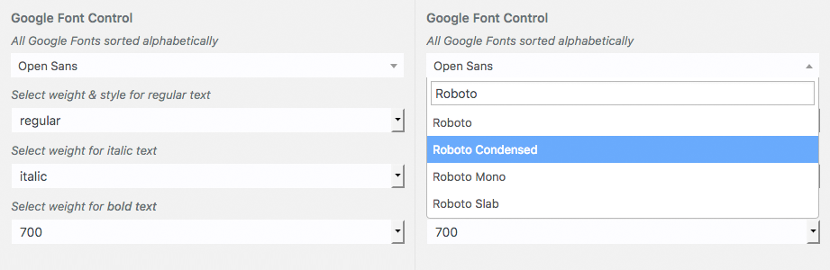
5.12 Google Font Select
One of the issues I've found with a lot of Google Font controls in numerous themes and plugins is that they don't allow for Italic and Bold weights. They'll change the regular text to the chosen font, but any text that you make bold or italic, reverts back to the original font. One of the reasons for this is because they don't specify the necessary italic and bold weights when retrieving the fonts from Google.
The Google Font Control will allow you to select a Google font and also specify the weight for the regular, italic and bold weights. The list of Google Font choices are stored in a json file generated by calling the Google Webfonts API. So as to avoid having to include your own Google Fonts API Key in your theme, you should generate this list of fonts before you add your theme options. You can get the complete list of Google Fonts, sorted by popularity by calling https://www.googleapis.com/webfonts/v1/webfonts?sort=popularity&key=YOUR-API-KEY. A complete list of fonts sorted alphabetically can be retrieved by https://www.googleapis.com/webfonts/v1/webfonts?key=YOUR-API-KEY (Don't forget to include your own Google Fonts API Key in the appropriate place).
When defining your control, you can specify the number of fonts to display and the order in which they should be displayed (either alphabetically or by popularity). If your default font, or the currently saved font, is not included in the list of fonts you're displaying, it will automatically be prepended to the start of the list as the default font. As an example, if you specify specify ‘Open Sans' as your default font, but only elect to show only the first 10 fonts, sorted alphabetically, then ‘Open Sans' will be automatically prepended to the list of fonts shown in the control.
The Font Family dropdown also implements a Select2 control, which adds an input field allowing you to type in and search for the desired font. This makes finding your font easier than having to scroll through the long list of Google Font names.
The setting is saved to the database as a json string. The easiest way to use this data in your theme is by using the json_decode() PHP function to convert the json string into an array. From there, it's easy enough to get the Font name, regular font weight, italic weight, bold weight, and the font category which is useful for specifying a fallback font.
Usage
add_control( $id, $args );
Parameters
$id – (string) (required) Customize Control object or ID of the Setting associated with this Control. Default: None
$args – (array) (optional) An associative array containing arguments for the setting. Default: empty array
Arguments for $args
label – Optional. The label that will be displayed Default: Blank
description – Optional. The text to display
section – Required. The Section where there control should appear
input_attrs – Optional. List of custom choices.
font_count – Optional. The number of fonts to display from the json file. Either positive integer or ‘all'. Default = ‘all'
orderby – Optional. The font list sort order. Either ‘alpha' or ‘popular'. Default = ‘alpha'
Example
$wp_customize->add_setting( 'sample_google_font_select',
	array(
		'default' => json_encode(
			array(
				'font' => 'Open Sans',
				'regularweight' => 'regular',
				'italicweight' => 'italic',
				'boldweight' => '700',
				'category' => 'sans-serif'
			)
		),
		'sanitize_callback' => 'skyrocket_google_font_sanitization'
	)
);

$wp_customize->add_control( new Skyrocket_Google_Font_Select_Custom_Control( $wp_customize, 'sample_google_font_select',
	array(
		'label' => __( 'Google Font Control' ),
		'description' => esc_html__( 'Sample custom control description' ),
		'section' => 'sample_custom_controls_section',
		'input_attrs' => array(
			'font_count' => 'all',
			'orderby' => 'alpha',
		),
	)
) );
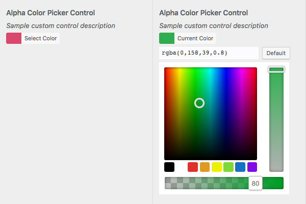
5.13 Alpha Color Picker
All props for this control go to Braad Martin. I've included it here (and also in my sample code) because it's so useful and I think it's a better option than the standard Color Control built into core. You can check out the original post Braad wrote about this control or check it out in his Github repo.
The Alpha Color Control is very similar to the Color Control built into core. The benefit of this control over the default control, is that it allows you to specify the opacity of the selected colour, which allows you to specify RGBa colours rather than just a solid hex colour.
The setting that gets saved to the database will be an RGBa color value (e.g. rgba(0,158,39,0.8) ) or a plain solid hex color (e.g. #009e27).
Usage
add_control( $id, $args );
Parameters
$id – (string) (required) Customize Control object or ID of the Setting associated with this Control. Default: None
$args – (array) (optional) An associative array containing arguments for the setting. Default: empty array
Arguments for $args
label – Optional. The label that will be displayed Default: Blank
description – Optional. The text to display
section – Required. The Section where there control should appear
show_opacity – Optional. Show or hide the opacity value on the opacity slider handle. Default: true
palette – Optional. Allows you to specify the colours used in the colour palette. Can be set to false to hide the palette. Default: WP color control palette
Example
$wp_customize->add_setting( 'sample_alpha_color',
	array(
		'default' => 'rgba(209,0,55,0.7)',
		'transport' => 'postMessage',
		'sanitize_callback' => 'skyrocket_hex_rgba_sanitization'
	)
);

$wp_customize->add_control( new Skyrocket_Customize_Alpha_Color_Control( $wp_customize, 'sample_alpha_color_picker',
	array(
		'label' => __( 'Alpha Color Picker Control' ),
		'description' => esc_html__( 'Sample custom control description' ),
		'section' => 'sample_custom_controls_section',
		'show_opacity' => true, // Optional. Show or hide the opacity value on the opacity slider handle. Default: true
		'palette' => array( // Optional. Select the colours for the colour palette . Default: WP color control palette
			'#000',
			'#fff',
			'#df312c',
			'#df9a23',
			'#eef000',
			'#7ed934',
			'#1571c1',
			'#8309e7'
		)
	)
) );
5.14 WPColorPicker Alpha Color Picker
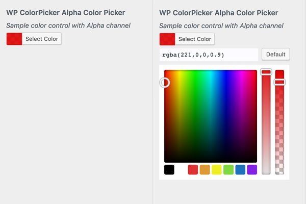
The WPColorPicker Alpha Color is another Custom Color Control that supports Alpha Channel selection (e.g. rgba(0,158,39,0.8) ). This controls uses a modifed version of the WordPress Color Picker script that supports Alpha Channel selection. Although the Customizer Custom Control was created by myself, all props for this modified WPColorPicker script go to Sergio.
The Alpha Color Control is very similar to the Color Control built into core. The benefit of this control over the default control, is that it allows you to specify the opacity of the selected colour, which allows you to specify RGBa colours rather than just a solid hex colour.
When defining your control, you can specify an array of 8 colour values to use for the palette colours, which are shown as small swatches the bottom of the control. You can specify colours using Hex values, RGB values, or RGBa values. I recommend not mixing Hex/RGB and RGBa colours as the WPColorPicker script has issues handling this. Either use all HEX/RGB values, or all RGBa values.
When defining your control, you can specify whether the Alpha Channel is reset (back to 1) or whether it remains the same value (default is to reset i.e. true). Setting 'resetalpha' => false will ensure the value in the alpha channel isn't reset back to 1 every time one of the palette colours is selected. Setting 'resetalpha' => true (or just not using this option) will ensure that the alpha channel value is reset back to 1 every time one of the palette colours is selected.
The WPColorPicker script has issues when mixing HEX colours and RGBa colours in the palette. If 'resetalpha' => false and you select an RGBa colour from the palette which has an alpha value less than 1, the correct colour will be selected. However, if you then select an Hex value from the palette, the alpha channel value will remain the same as the previous selection, causing an incorrect colour to be selected.
When specifying all Hex values in the Palette, it's best to set 'resetalpha' => true (or just don't specify this option as the default value is true). When using all RGBa values in the Palette, it's best to set 'resetalpha' => false.
The setting that gets saved to the database will be an RGBa color value (e.g. rgba(0,158,39,0.8) ) or a plain solid hex color (e.g. #009e27).
Usage
add_control( $id, $args );
Parameters
$id – (string) (required) Customize Control object or ID of the Setting associated with this Control. Default: None
$args – (array) (optional) An associative array containing arguments for the setting. Default: empty array
Arguments for $args
label – Optional. The label that will be displayed Default: Blank
description – Optional. The text to display
section – Required. The Section where there control should appear
input_attrs – Optional. List of control options.
resetalpha – Optional. Specify whether the Alpha Channel is reset (back to 1) or whether it remains the same value every time one of the palette colours is selected. Default = ‘true'
palette – Optional. Allows you to specify the colours used in the colour palette. Can be set to false to hide the palette. Default: WP color control palette
Example 1
$wp_customize->add_setting( 'sample_wpcolorpicker_alpha_color',
	array(
		'default' => 'rgba(209,0,55,0.7)',
		'transport' => 'postMessage',
		'sanitize_callback' => 'skyrocket_hex_rgba_sanitization'
	)
);

$wp_customize->add_control( new Skyrocket_Alpha_Color_Control( $wp_customize, 'sample_wpcolorpicker_alpha_color',
	array(
		'label' => __( 'WP ColorPicker Alpha Color Picker' ),
		'description' => esc_html__( 'Sample color control with Alpha channel' ),
		'section' => 'sample_custom_controls_section'
		'input_attrs' => array(
			'palette' => array(
				'#000000',
				'#ffffff',
				'#dd3333',
				'#dd9933',
				'#eeee22',
				'#81d742',
				'#1e73be',
				'#8224e3',
			)
		),
	)
) );
Example 2
$wp_customize->add_setting( 'sample_wpcolorpicker_alpha_color2',
	array(
		'default' => 'rgba(209,0,55,0.7)',
		'transport' => 'postMessage',
		'sanitize_callback' => 'skyrocket_hex_rgba_sanitization'
	)
);
$wp_customize->add_control( new Skyrocket_Alpha_Color_Control( $wp_customize, 'sample_wpcolorpicker_alpha_color2',
	array(
		'label' => __( 'Alpha Color Picker Control' ),
		'description' => esc_html__( 'Sample color control with Alpha channel' ),
		'section' => 'sample_custom_controls_section',
		'input_attrs' => array(
			'resetalpha' => false,
			'palette' => array(
				'rgba(99,78,150,1)',
				'rgba(67,78,150,1)',
				'rgba(34,78,150,.7)',
				'rgba(3,78,150,1)',
				'rgba(7,110,230,.9)',
				'rgba(234,78,150,1)',
				'rgba(99,78,150,.5)',
				'rgba(190,120,120,.5)',
			)
		),
	)
) );
5.15 Sortable Pill Checkbox
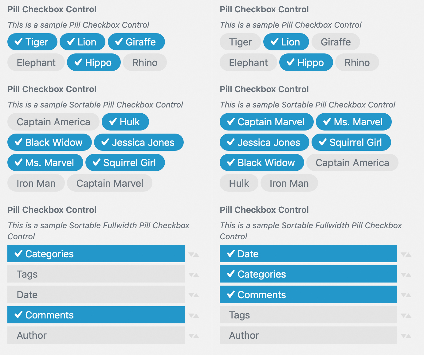
The Sortable Pill Checkbox works similar to an ordinary checkbox control, in that you can select one or more items out of a number of items. Instead of checkboxes, this control will display each item as a small ‘pill'. When each pill/checkbox is selected, as well as changing color, the selected item will also display a tick to improve accessibility and to make it more obvious as to whether an item is selected or not. These pill checkboxes also have the option to be sortable using drag ‘n drop. This is useful where you want to provide your users with a set of options, as well as providing them the ability to control the order of those options. Lastly, rather than small variabled sized pills, you can also opt to display them fullwidth. This will show each pill the same size, rather than each having a variable width. A common use of this type of control is where you might allow a user to select what meta content to display for their blog posts, along with allowing them to change the order that each item is displayed in.
When adding your control, you can specify whether you want the pills to be sortable by setting 'sortable' => true (default is non-sortable i.e. false). You can also spcify if you want the pills displayed full width by setting 'fullwidth' => true (default is variable width i.e. false).
The setting that gets saved to the database is a comma-separated string of values for each of the items that are selected.
Usage
add_control( $id, $args );
Parameters
$id – (string) (required) Customize Control object or ID of the Setting associated with this Control. Default: None
$args – (array) (optional) An associative array containing arguments for the setting. Default: empty array
Arguments for $args
label – Optional. The label that will be displayed Default: Blank
description – Optional. The text to display
section – Required. The Section where there control should appear
input_attrs – Optional. List of control options.
sortable – Optional. Allow the pills to be sortable using drag ‘n drop. Default = ‘false'
fullwidth – Optional. Display the pills fullwidth, instead of variable width. Default = ‘false'
choices – Required. List of custom choices.
key – Required. Data that will be stored for the setting
value – Required. Text to display in the control
Example 1
// Test of Pill Checkbox Custom Control
$wp_customize->add_setting( 'sample_pill_checkbox',
	array(
		'default' => 'tiger,elephant,hippo',
		'transport' => 'refresh',
		'sanitize_callback' => 'skyrocket_text_sanitization'
	)
);
$wp_customize->add_control( new Skyrocket_Pill_Checkbox_Custom_Control( $wp_customize, 'sample_pill_checkbox',
	array(
		'label' => __( 'Pill Checkbox Control', 'skyrocket' ),
		'description' => esc_html__( 'This is a sample Pill Checkbox Control', 'skyrocket' ),
		'section' => 'sample_custom_controls_section',
		'input_attrs' => array(
			'sortable' => false,
			'fullwidth' => false,
		),
		'choices' => array(
			'tiger' => __( 'Tiger', 'skyrocket' ),
			'lion' => __( 'Lion', 'skyrocket' ),
			'giraffe' => __( 'Giraffe', 'skyrocket'  ),
			'elephant' => __( 'Elephant', 'skyrocket'  ),
			'hippo' => __( 'Hippo', 'skyrocket'  ),
			'rhino' => __( 'Rhino', 'skyrocket'  ),
		)
	)
) );
Example 2
// Test of Pill Checkbox Custom Control with Sortable option
$wp_customize->add_setting( 'sample_pill_checkbox2',
	array(
		'default' => 'captainmarvel,msmarvel,squirrelgirl',
		'transport' => 'refresh',
		'sanitize_callback' => 'skyrocket_text_sanitization'
	)
);
$wp_customize->add_control( new Skyrocket_Pill_Checkbox_Custom_Control( $wp_customize, 'sample_pill_checkbox2',
	array(
		'label' => __( 'Pill Checkbox Control', 'skyrocket' ),
		'description' => esc_html__( 'This is a sample Sortable Pill Checkbox Control', 'skyrocket' ),
		'section' => 'sample_custom_controls_section',
		'input_attrs' => array(
			'sortable' => true,
			'fullwidth' => false,
		),
		'choices' => array(
			'captainamerica' => __( 'Captain America', 'skyrocket' ),
			'ironman' => __( 'Iron Man', 'skyrocket' ),
			'captainmarvel' => __( 'Captain Marvel', 'skyrocket'  ),
			'msmarvel' => __( 'Ms. Marvel', 'skyrocket'  ),
			'Jessicajones' => __( 'Jessica Jones', 'skyrocket'  ),
			'squirrelgirl' => __( 'Squirrel Girl', 'skyrocket'  ),
			'blackwidow' => __( 'Black Widow', 'skyrocket'  ),
			'hulk' => __( 'Hulk', 'skyrocket'  ),
		)
	)
) );
Example 3
// Test of Pill Checkbox Custom Control with Sortable and Fullwidth options
$wp_customize->add_setting( 'sample_pill_checkbox3',
	array(
		'default' => 'author,categories,comments',
		'transport' => 'refresh',
		'sanitize_callback' => 'skyrocket_text_sanitization'
	)
);
$wp_customize->add_control( new Skyrocket_Pill_Checkbox_Custom_Control( $wp_customize, 'sample_pill_checkbox3',
	array(
		'label' => __( 'Pill Checkbox Control', 'skyrocket' ),
		'description' => esc_html__( 'This is a sample Sortable Fullwidth Pill Checkbox Control', 'skyrocket' ),
		'section' => 'sample_custom_controls_section',
		'input_attrs' => array(
			'sortable' => true,
			'fullwidth' => true,
		),
		'choices' => array(
			'date' => __( 'Date', 'skyrocket' ),
			'author' => __( 'Author', 'skyrocket' ),
			'categories' => __( 'Categories', 'skyrocket'  ),
			'tags' => __( 'Tags', 'skyrocket'  ),
			'comments' => __( 'Comments', 'skyrocket'  ),
		)
	)
) );
5.16 Divider
The Divider Control allows you to display a thin horizontal divider between your controls. There's no settings saved for this control, it's purely for helping you to visually separate your different controls.
When adding your control, you can specify the width of the divider line, the type of line to display, and the margin above and below the divider (in px).

Usage
add_control( $id, $args );
Parameters
$id – (string) (required) Customize Control object or ID of the Setting associated with this Control. Default: None
$args – (array) (optional) An associative array containing arguments for the setting. Default: empty array
Arguments for $args
section – Required. The Section where there control should appear
input_attrs – Optional. List of control options.
width – Optional. The width of the divider line. Accepts ‘default', ‘full', ‘half'. Default: ‘default'
type – Optional. The style used for the divider. Accepts ‘solid', ‘dashed', ‘dotted', ‘double'. Default: ‘solid'
margintop – Optional. The margin above the divider (in px). Default: 20
marginbottom – Optional. The margin below the divider (in px). Default: 20
Example
$wp_customize->add_setting( 'sample_divider_control',
	array(
		'default' => $this->defaults['sample_divider_control'],
		'transport' => 'postMessage',
		'sanitize_callback' => ''
	)
);
$wp_customize->add_control( new Skyrocket_Divider_Custom_Control( $wp_customize, 'sample_divider_control',
	array(
		'section' => 'sample_custom_controls_section',
		'input_attrs' => array(
			'width' => 'full',
			'type' => 'solid',
			'margintop' => 15,
			'marginbottom' => 30,
		),
	)
) );
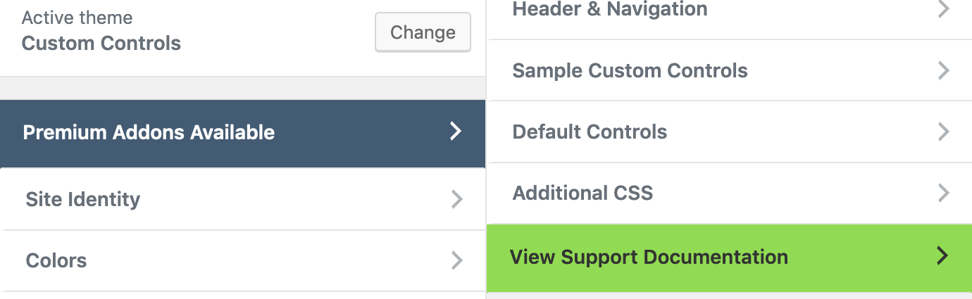
5.17 Upsell Section
The Upsell Section is a Custom Section that allows you to provide a link to an external URL, such as a theme website. This section is useful if you're upselling premium themes or plugins.
The Upsell Section is similar to standard core Customizer section except that instead of being able to navigate into the section, it simply provides a link to an external URL. Since this is a Section rather than a Custom Control, you probably want to add this to the same function that defines your other Sections.
When defining your section, you can specify the URL, the text to use for the link as well as the background and text colours for the section. The ability to define the colours allows you to show this section in your own branding colours, as well as making this link more noticeable within the Customizer.
Since this is a Custom Section, rather than a Custom Control, there's no values saved to the database.
Usage
add_section( $id, $args );
Parameters
$id – (string) (required) Customize Control object or ID of the Setting associated with this Control. Default: None
$args – (array) (optional) An associative array containing arguments for the setting. Default: empty array
Arguments for $args
title – The visible name of the section
priority – Optional. This controls the order in which this section appears in the Theme Customizer sidebar
url – The external url to link to
backgroundcolor – Optional. The background colour of the section. Default: #fff
textcolor – Optional. The text colour for the title. Default: #555d66
Example
$wp_customize->add_section( new Skyrocket_Upsell_Section( $wp_customize, 'upsell_section',
	array(
		'title' => __( 'Premium Addons Available', 'skyrocket' ),
		'url' => 'https://skyrocketthemes.com',
		'backgroundcolor' => '#344860',
		'textcolor' => '#fff',
		'priority' => 0,
	)
) );
6. Summary
Hopefully this second part of my Customizer Developers Guide gives you a fairly good understanding of how to create your own Custom Controls. Along with Part 1 of this guide, you should be well on your way to adding Customizer functionality to your theme or plugin.
As mentioned above, I've added some sample code to Github which will show you how to use the built-in core Controls, along with all these new Custom Controls. There's also some example code for implementing Live Preview refreshes. You can check out all that code in my Customizer Custom Controls repo on Github.
You can also download a sample theme and plugin showing how to implement these Controls, with the following Github links. Please note though, since both the sample theme and sample plugin use the same Customizer Controls code, don't try to activate the sample plugin on the same site where the sample theme is activated. This will cause an error as you'll be trying to instatiate classes with the same name since they're both using the same code base:
Customizer Controls Sample Theme
Customizer Controls Sample Plugin
See also: The WordPress Customizer – A Developers Guide (Part 1)
Awesome series on the Customizer! This is exactly the kind of thorough content that really helps the WP dev community. Glad you like my Alpha Color Picker control also 🙂
Thanks Braad. I appreciate the kind words. And thanks also for creating that Alpha Color Picker. It works really well and as I said above, I think it’s a much more useful option than the standard color control.
This is it! Thank you so much for sharing your knowledge about these custom controls. I couldn’t get my TinyMCE working but with your tutorial, piece of cake!
There’s not a lot of documentation on this subject out there, Keep up the good work!
Thanks for the kind words Kevin. It’s great to hear that you’ve found all this content useful.