If you've used WordPress in the last couple of years, you're no doubt familiar with, or have at least heard of, the Customizer. The WordPress Customizer allows users to modify and configure theme options, whilst also providing them with a live-preview of those changes. The Customizer was built to provide theme developers with a standard interface they could use when providing customisation options within their theme.
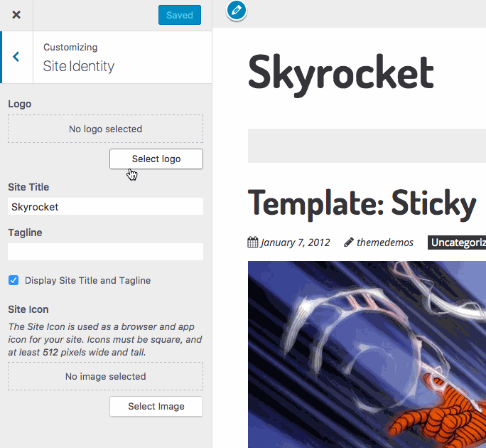
Even if the theme you're using doesn't provide any additional theme options, there are certain core features that the Customizer will allow you to change and live-preview with any theme. These include the Site Identity, Menus, Widgets, Static Front Page, and (since WordPress 4.7) Additional CSS.
Whether you like the WordPress Customizer or not, it's not going anywhere (unfortunately). It was even made mandatory (almost two years ago now), that any theme being submitted to the Theme Directory (on WordPress.org) and that also includes theme options, must now use the WordPress Customizer.
I've talked about the Customizer in the past and one of the (many) things I find frustating about it is the lack of decent documentation for developers, with the Theme Handbook even going so far as to suggest that you need to study all the Customizer code in Core.
it is strongly recommended that developers study the core customizer code (all core files containing “customize”). This is considered the canonical, official documentation for the Customize API outside of the inline documentation within the core code.
Considering the push for people to use the Customizer, especially developers, it's disheartening to see the lack of decent official documentation. Hopefully though, if you're adding Customizer functionality to your theme, the following details, along with Part 2 of this post, will come in handy.
Developing for the Customizer
There are four main types of Customizer objects that you need to deal with when adding theme options to the Customizer. Panels, Sections, Settings, and Controls.
Panels are containers for Sections. They allow you to group multiple Sections together.
Sections are where your Controls reside. You'll typically have multiple Controls in each Section.
Settings associate Controls with the settings that are saved in the database.
Controls are the actual UI Elements. Common Controls include things like Checkboxes, Select Lists and Radio Buttons, just to name a few. Settings and Controls work together.
1. Registering Customizer Content
To add anything to the Customizer, you need to use the customize_register action hook. This hook gives you access to the $wp_customize object, which is an instance of the WP_Customize_Manager class. It's this class object that controls the Customizer screen.
Whenever you add your Panels, Sections, Settings or Controls (including Custom Controls), they need to be within a function used by this hook.
Example
/**
 * Add our Customizer content
 */
function mytheme_customize_register( $wp_customize ) {
	// Add all your Customizer content (i.e. Panels, Sections, Settings & Controls) here...
};
add_action( 'customize_register', 'mytheme_customize_register' );
2. Adding Panels
Panels allow you to group multiple Sections together. Sections do not need to be nested under a panel. Panels must contain at least one Section, which must contain at least one Control, to be displayed.
Usage
add_panel( $id, $args );
Parameters
$id – (string) (required) A unique slug-like string to use as an id. Default: None
$args – (array) (required) An associative array containing arguments for the control. Default: None
Arguments for $args
title – The visible name of the panel.
description – Optional. The description displayed at the top of the panel, hidden behind a help icon.
priority – Optional. This controls the order in which this section appears in the Theme Customizer sidebar.
capability – Optional. Show or hide the section based on the user’s permission levels. Default is edit_theme_options
theme_supports – Optional. Show or hide the section based on whether the theme supports a particular feature (using add_theme_support).
active_callback – Optional. Show or hide panel based on currently viewed page. Example: ‘active_callback' => ‘is_front_page'.
Example
/**
 * Add our Header & Navigation Panel
 */
 $wp_customize->add_panel( 'header_naviation_panel',
 	array(
		'title' => __( 'Header & Navigation' ),
		'description' => esc_html__( 'Adjust your Header and Navigation sections.' ), // Include html tags such as

		'priority' => 160, // Not typically needed. Default is 160
		'capability' => 'edit_theme_options', // Not typically needed. Default is edit_theme_options
		'theme_supports' => '', // Rarely needed
		'active_callback' => '', // Rarely needed
	)
);
If you do want to change the location of your Panel (or Section), the priorities of the core sections are below:
| Title | ID | Priority (Order) |
| Site Title & Tagline | title_tagline | 20 |
| Colors | colors | 40 |
| Header Image | header_image | 60 |
| Background Image | background_image | 80 |
| Menus (Panel) | nav_menus | 100 |
| Widgets (Panel) | widgets | 110 |
| Static Front Page | static_front_page | 120 |
| default | 160 | |
| Additional CSS | custom_css | 200 |
You only need to include fields that you want to override the default values of. As an example, the default priority (160) is typically acceptable which means that you don't need to specify that option when registering your Panel (or Section).
3. Adding Sections
Sections are where your Controls will reside. You’ll typically have multiple Controls in each Section. Sections can be added to Panels, but in most instances, this wont be necessary.
Usage
add_section( $id, $args );
Parameters
$id – (string) (required) Customize Section object or Section ID, which is a unique slug-like string. Default: None
$args – (array) (optional) An associative array containing arguments for the control. Default: empty array
Arguments for $args
title – The visible name of the section.
description – Optional. The visible description displayed at the top of the section.
panel – Optional. The id of the Panel where this Section should reside.
priority – Optional. This controls the order in which this section appears in the Theme Customizer sidebar.
capability – Optional. Show or hide the section based on the user’s permission levels. Default is edit_theme_options
theme_supports – Optional. Show or hide the section based on whether the theme supports a particular feature (using add_theme_support).
active_callback – Optional. Show or hide section based on currently viewed page. Example: ‘active_callback' => ‘is_front_page'.
description_hidden – Optional. Indicates whether the Section's description should be hidden behind a help icon. Default: False
Example
/**
 * Add our Sample Section
 */
$wp_customize->add_section( 'sample_custom_controls_section',
	array(
		'title' => __( 'Sample Custom Controls' ),
		'description' => esc_html__( 'These are an example of Customizer Custom Controls.' ),
		'panel' => '', // Only needed if adding your Section to a Panel
		'priority' => 160, // Not typically needed. Default is 160
		'capability' => 'edit_theme_options', // Not typically needed. Default is edit_theme_options
		'theme_supports' => '', // Rarely needed
		'active_callback' => '', // Rarely needed
		'description_hidden' => 'false', // Rarely needed. Default is False
	)
);
4. Adding Settings
Settings and Controls work together. Settings handle live-previewing, saving, and sanitization of your customizer objects. Each Control that you register needs to have a matching Setting.
Usage
add_setting( $id, $args );
Parameters
$id – (string) (required) A unique slug-like string to use as an id. Default: None
$args – (array) (required) An associative array containing arguments for the setting. Default: None
Arguments for $args
default – Optional. The default value for the associated control if no value exists in the DB. Default: Blank
transport – Optional. Defines how the live preview is updated. Default: refresh.
type – Optional. Defines how the setting will be saved. Default: theme_mod.
capability – Optional. Show or hide the control based on the user’s permission levels. Default is edit_theme_options
theme_supports – Optional. Show or hide the control based on whether the theme supports a particular feature (using add_theme_support).
validate_callback – Optional. The name of the function that will be called to validate Customizer settings
sanitize_callback – Optional. The name of the function that will be called to sanitize the input data before saving it to the database
sanitize_js_callback – Optional. The name of the function that will be called to sanitize the data before outputting to javascript code.
dirty – Optional. Rarely needed. Whether or not the setting is initially dirty when created. Default: False
Example
$wp_customize->add_setting( 'sample_default_text',
	array(
		'default' => '', // Optional.
		'transport' => 'refresh', // Optional. 'refresh' or 'postMessage'. Default: 'refresh'
		'type' => 'theme_mod', // Optional. 'theme_mod' or 'option'. Default: 'theme_mod'
		'capability' => 'edit_theme_options', // Optional. Default: 'edit_theme_options'
		'theme_supports' => '', // Optional. Rarely needed
		'validate_callback' => '', // Optional. The name of the function that will be called to validate Customizer settings
		'sanitize_callback' => '', // Optional. The name of the function that will be called to sanitize the input data before saving it to the database
		'sanitize_js_callback' => '', // Optional. The name of the function that will be called to sanitize the data before outputting to javascript code. Basically to_json.
		'dirty' => false, // Optional. Rarely needed. Whether or not the setting is initially dirty when created. Default: False
	)
);
There are two types of settings: Options ('type' => 'option') and Theme Modifications ('type' => 'theme_mod'). Options are typically used to specify site settings, that is, settings that affect the site regardless of the active theme. Theme Mods are used to define settings specific to a particular theme. Most theme options should be theme_mods.
Although the sanitize_callback parameter is optional, if you're submitting your theme to the WordPress.org Theme Directory, it's part of their requirement that every call to add_setting must specify a sanitization function. The official Theme Check plugin will also display a warning if you haven't specified one.
5. Adding Controls
Controls are the actual UI Elements that you'll use to modify your theme settings. There are a number of Controls built into WordPress Core (e.g. Checkboxes, Select Lists, Radio Buttons etc.). For all other types of controls, you'll need to extend the WP_Customize_Control class to create your own custom controls. I'll be taking you through creating Custom Controls in Part 2 of this Post.
There are several different types of basic Core Controls that are ready to use straight-out-of-the-box. These include text, checkbox, textarea, radio, select and dropdown-pages controls. Later versions of WordPress also introduced Color, Media, Image and Cropped Image controls. Text input controls can also be replaced with more specific inputs by specifying email, url, number, hidden, or date, instead of text.
For easy reference, the Core Controls outlined in this post are:
Input Control
Checkbox Control
Select Control
Radio Button Control
Dropdown Pages Control
Textarea Control
Color Control
Media Control
Image Control
Cropped Image Control
Date Time Control
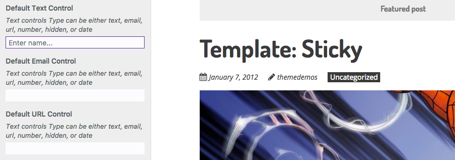
5.1 Input Control
Usage
add_control( $id, $args );
Parameters
$id – (string) (required) Customize Control object or ID of the Setting associated with this Control. Default: None
$args – (array) (optional) An associative array containing arguments for the setting. Default: empty array
Arguments for $args
label – Optional. The label that will be displayed Default: Blank
description – Optional. The description to display under the label. Default: Blank.
section – Required. The Section where there control should appear
priority – Required. Determines order in which the controls will be displayed within the section. Default: 10.
type – Required. The type of control to display. Type can be either text, email, url, number, hidden, or date. Default: ‘text'
capability – Optional. Show or hide the control based on the user’s permission levels. Normally derived from the capabilities of the Setting. Default is edit_theme_options
input_attrs – Optional. List of custom input attributes for control output. Only used for textarea and input fields. Default: Blank
Example
$wp_customize->add_setting( 'sample_default_text',
	array(
		'default' => '',
		'transport' => 'refresh',
		'sanitize_callback' => 'skyrocket_text_sanitization'
	)
);

$wp_customize->add_control( 'sample_default_text',
	array(
		'label' => __( 'Default Text Control' ),
		'description' => esc_html__( 'Text controls Type can be either text, email, url, number, hidden, or date' ),
		'section' => 'default_controls_section',
		'priority' => 10, // Optional. Order priority to load the control. Default: 10
		'type' => 'text', // Can be either text, email, url, number, hidden, or date
		'capability' => 'edit_theme_options', // Optional. Default: 'edit_theme_options'
		'input_attrs' => array( // Optional.
			'class' => 'my-custom-class',
			'style' => 'border: 1px solid rebeccapurple',
			'placeholder' => __( 'Enter name...' ),
		),
	)
);
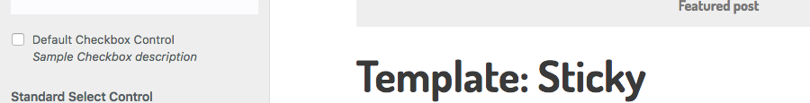
5.2 Checkbox Control
Usage
add_control( $id, $args );
Parameters
$id – (string) (required) Customize Control object or ID of the Setting associated with this Control. Default: None
$args – (array) (optional) An associative array containing arguments for the setting. Default: empty array
Arguments for $args
label – Optional. The label that will be displayed Default: Blank
description – Optional. The description to display under the label. Default: Blank.
section – Required. The Section where there control should appear
priority – Required. Determines order in which the controls will be displayed within the section. Default: 10.
type – Required.
capability – Optional. Show or hide the control based on the user’s permission levels. Normally derived from the capabilities of the Setting. Default is edit_theme_options
input_attrs – Optional. List of custom input attributes for control output. Only used for textarea and input fields. Default: Blank
Example
$wp_customize->add_setting( 'sample_default_checkbox',
	array(
		'default' => 0,
		'transport' => 'refresh',
		'sanitize_callback' => 'skyrocket_switch_sanitization'
	)
);

$wp_customize->add_control( 'sample_default_checkbox',
	array(
		'label' => __( 'Default Checkbox Control', 'ephemeris' ),
		'description' => esc_html__( 'Sample description' ),
		'section'  => 'default_controls_section',
		'priority' => 10, // Optional. Order priority to load the control. Default: 10
		'type'=> 'checkbox',
		'capability' => 'edit_theme_options', // Optional. Default: 'edit_theme_options'
	)
);
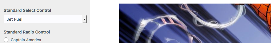
5.3 Select Control
Usage
add_control( $id, $args );
Parameters
$id – (string) (required) Customize Control object or ID of the Setting associated with this Control. Default: None
$args – (array) (optional) An associative array containing arguments for the setting. Default: empty array
Arguments for $args
label – Optional. The label that will be displayed Default: Blank
description – Optional. The description to display under the label. Default: Blank.
section – Required. The Section where there control should appear
priority – Required. Determines order in which the controls will be displayed within the section. Default: 10.
type – Required.
capability – Optional. Show or hide the control based on the user’s permission levels. Normally derived from the capabilities of the Setting. Default is edit_theme_options
choices – Optional. List of custom choices. Only used for radio and select fields. Default: Blank
Example
$wp_customize->add_setting( 'sample_default_select',
	array(
		'default' => 'jet-fuel',
		'transport' => 'refresh',
		'sanitize_callback' => 'skyrocket_radio_sanitization'
	)
);

$wp_customize->add_control( 'sample_default_select',
	array(
		'label' => __( 'Standard Select Control' ),
		'description' => esc_html__( 'Sample description' ),
		'section' => 'default_controls_section',
		'priority' => 10, // Optional. Order priority to load the control. Default: 10
		'type' => 'select',
		'capability' => 'edit_theme_options', // Optional. Default: 'edit_theme_options'
		'choices' => array( // Optional.
			'wordpress' => __( 'WordPress' ),
			'hamsters' => __( 'Hamsters' ),
			'jet-fuel' => __( 'Jet Fuel' ),
			'nuclear-energy' => __( 'Nuclear Energy' )
		)
	)
);
5.4 Radio Button Control
Usage
add_control( $id, $args );
Parameters
$id – (string) (required) Customize Control object or ID of the Setting associated with this Control. Default: None
$args – (array) (optional) An associative array containing arguments for the setting. Default: empty array
Arguments for $args
label – Optional. The label that will be displayed Default: Blank
description – Optional. The description to display under the label. Default: Blank.
section – Required. The Section where there control should appear
priority – Required. Determines order in which the controls will be displayed within the section. Default: 10.
type – Required.
capability – Optional. Show or hide the control based on the user’s permission levels. Normally derived from the capabilities of the Setting. Default is edit_theme_options
choices – Optional. List of custom choices. Only used for radio and select fields. Default: Blank
Example
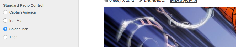
$wp_customize->add_setting( 'sample_default_radio',
	array(
		'default' => 'spider-man',
		'transport' => 'refresh',
		'sanitize_callback' => 'skyrocket_radio_sanitization'
	)
);

$wp_customize->add_control( 'sample_default_radio',
	array(
		'label' => __( 'Standard Radio Control' ),
		'description' => esc_html__( 'Sample description' ),
		'section' => 'default_controls_section',
		'priority' => 10, // Optional. Order priority to load the control. Default: 10
		'type' => 'radio',
		'capability' => 'edit_theme_options', // Optional. Default: 'edit_theme_options'
		'choices' => array( // Optional.
			'captain-america' => __( 'Captain America' ),
			'iron-man' => __( 'Iron Man' ),
			'spider-man' => __( 'Spider-Man' ),
			'thor' => __( 'Thor' )
		)
	)
);
5.5 Dropdown Pages Control
Usage
add_control( $id, $args );
Parameters
$id – (string) (required) Customize Control object or ID of the Setting associated with this Control. Default: None
$args – (array) (optional) An associative array containing arguments for the setting. Default: empty array
Arguments for $args
label – Optional. The label that will be displayed Default: Blank
description – Optional. The description to display under the label. Default: Blank.
section – Required. The Section where there control should appear
priority – Required. Determines order in which the controls will be displayed within the section. Default: 10.
type – Required.
capability – Optional. Show or hide the control based on the user’s permission levels. Normally derived from the capabilities of the Setting. Default is edit_theme_options
Example
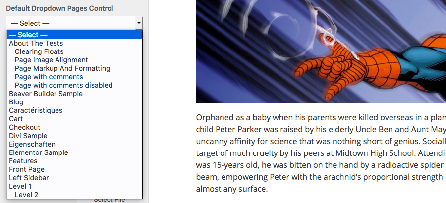
$wp_customize->add_setting( 'sample_default_dropdownpages',
	array(
		'default' => '1548',
		'transport' => 'refresh',
		'sanitize_callback' => 'absint'
	)
);

$wp_customize->add_control( 'sample_default_dropdownpages',
	array(
		'label' => __( 'Default Dropdown Pages Control' ),
		'description' => esc_html__( 'Sample description' ),
		'section' => 'default_controls_section',
		'priority' => 10, // Optional. Order priority to load the control. Default: 10
		'type' => 'dropdown-pages',
		'capability' => 'edit_theme_options', // Optional. Default: 'edit_theme_options'
	)
);
5.6 Textarea Control
Usage
add_control( $id, $args );
Parameters
$id – (string) (required) Customize Control object or ID of the Setting associated with this Control. Default: None
$args – (array) (optional) An associative array containing arguments for the setting. Default: empty array
Arguments for $args
label – Optional. The label that will be displayed Default: Blank
description – Optional. The description to display under the label. Default: Blank.
section – Required. The Section where there control should appear
priority – Required. Determines order in which the controls will be displayed within the section. Default: 10.
type – Required.
capability – Optional. Show or hide the control based on the user’s permission levels. Normally derived from the capabilities of the Setting. Default is edit_theme_options
input_attrs – Optional. List of custom input attributes for control output. Only used for textarea and input fields. Default: Blank
Example
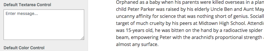
$wp_customize->add_setting( 'sample_default_textarea',
	array(
		'default' => '',
		'transport' => 'refresh',
		'sanitize_callback' => 'wp_filter_nohtml_kses'
	)
);

$wp_customize->add_control( 'sample_default_textarea',
	array(
		'label' => __( 'Default Textarea Control' ),
		'description' => esc_html__( 'Sample description' ),
		'section' => 'default_controls_section',
		'priority' => 10, // Optional. Order priority to load the control. Default: 10
		'type' => 'textarea',
		'capability' => 'edit_theme_options', // Optional. Default: 'edit_theme_options'
		'input_attrs' => array( // Optional.
			'class' => 'my-custom-class',
			'style' => 'border: 1px solid #999',
			'placeholder' => __( 'Enter message...' ),
		),
	)
);
5.7 Color Control
Usage
add_control( $id, $args );
Parameters
$id – (string) (required) Customize Control object or ID of the Setting associated with this Control. Default: None
$args – (array) (optional) An associative array containing arguments for the setting. Default: empty array
Arguments for $args
label – Optional. The label that will be displayed Default: Blank
description – Optional. The description to display under the label. Default: Blank.
section – Required. The Section where there control should appear
priority – Required. Determines order in which the controls will be displayed within the section. Default: 10.
type – Required.
capability – Optional. Show or hide the control based on the user’s permission levels. Normally derived from the capabilities of the Setting. Default is edit_theme_options
Example
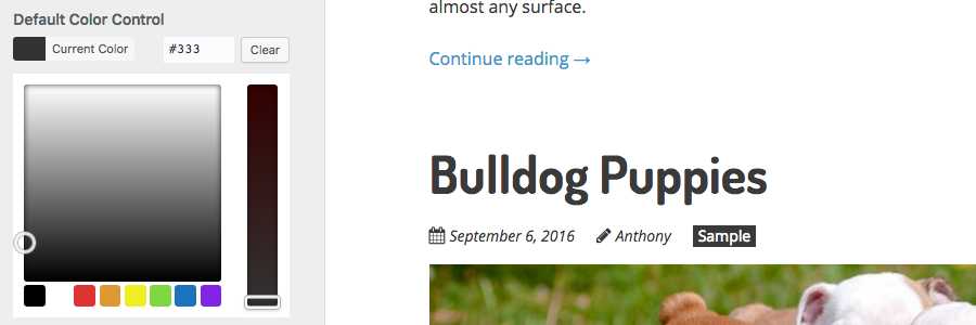
$wp_customize->add_setting( 'sample_default_color',
	array(
		'default' => '#333',
		'transport' => 'refresh',
		'sanitize_callback' => 'sanitize_hex_color'
	)
);

$wp_customize->add_control( 'sample_default_color',
	array(
		'label' => __( 'Default Color Control' ),
		'description' => esc_html__( 'Sample description' ),
		'section' => 'default_controls_section',
		'priority' => 10, // Optional. Order priority to load the control. Default: 10
		'type' => 'color',
		'capability' => 'edit_theme_options', // Optional. Default: 'edit_theme_options'
	)
);
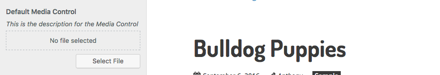
5.8 Media Control
The media control will save the attachment ID for the selected media file to the database, rather than the file URL. However, note that the default value of the setting must still be a URL. Use the wp_get_attachment_url() function to retrieve the image url from the saved ID. (e.g. wp_get_attachment_url( get_theme_mod( 'sample_default_cropped_image' ) ) )
The media control can be used for any type of media, be it an image, audio, video, PDF document, or any other file format that your server supports. To restrict a media control instance to a particular type of content, use the mime_type parameter when adding the control.
You can use the mime_type parameter to restrict selection to all images by using “image” or you can narrow the restriction further by using “image/jpeg” for .JPG/.JPEG images or “image/png” for .PNG images. You can also specify “application” for application documents or again, narrow the selection further by using “application/pdf” for .PDF files or “application/msword” for .DOC files.
Usage
add_control( $id, $args );
Parameters
$id – (string) (required) Customize Control object or ID of the Setting associated with this Control. Default: None
$args – (array) (optional) An associative array containing arguments for the setting. Default: empty array
Arguments for $args
label – Optional. The label that will be displayed Default: Blank
description – Optional. The description to display under the label. Default: Blank.
section – Required. The Section where there control should appear
mime_type – Required. Restrict the media library to only show a specific type of file. mime_type can be image, audio, video, application, text
button_labels – Optional. Array containing a list of labels for the control
Example
$wp_customize->add_setting( 'sample_default_media',
	array(
		'default' => '',
		'transport' => 'refresh',
		'sanitize_callback' => 'absint'
	)
);

$wp_customize->add_control( new WP_Customize_Media_Control( $wp_customize, 'sample_default_media',
	array(
		'label' => __( 'Default Media Control' ),
		'description' => esc_html__( 'This is the description for the Media Control' ),
		'section' => 'default_controls_section',
		'mime_type' => 'image',  // Required. Can be image, audio, video, application, text
		'button_labels' => array( // Optional
			'select' => __( 'Select File' ),
			'change' => __( 'Change File' ),
			'default' => __( 'Default' ),
			'remove' => __( 'Remove' ),
			'placeholder' => __( 'No file selected' ),
			'frame_title' => __( 'Select File' ),
			'frame_button' => __( 'Choose File' ),
		)
	)
) );
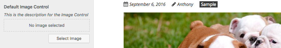
5.9 Image Control
The Cropped Image Control will save the URL of the uploaded image to the database. When sanitizing your setting, use esc_url_raw for the 'sanitize_callback'.
Usage
add_control( $id, $args );
Parameters
$id – (string) (required) Customize Control object or ID of the Setting associated with this Control. Default: None
$args – (array) (optional) An associative array containing arguments for the setting. Default: empty array
Arguments for $args
label – Optional. The label that will be displayed Default: Blank
description – Optional. The description to display under the label. Default: Blank.
section – Required. The Section where there control should appear
button_labels – Optional. Array containing a list of labels for the control
Example
$wp_customize->add_setting( 'sample_default_image',
	array(
		'default' => '',
		'transport' => 'refresh',
		'sanitize_callback' => 'esc_url_raw'
	)
);

$wp_customize->add_control( new WP_Customize_Image_Control( $wp_customize, 'sample_default_image',
	array(
		'label' => __( 'Default Image Control' ),
		'description' => esc_html__( 'This is the description for the Image Control' ),
		'section' => 'default_controls_section',
		'button_labels' => array( // Optional.
			'select' => __( 'Select Image' ),
			'change' => __( 'Change Image' ),
			'remove' => __( 'Remove' ),
			'default' => __( 'Default' ),
			'placeholder' => __( 'No image selected' ),
			'frame_title' => __( 'Select Image' ),
			'frame_button' => __( 'Choose Image' ),
		)
	)
) );
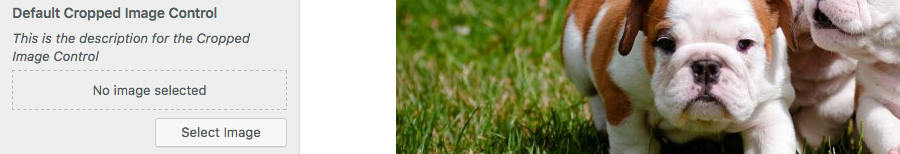
5.10 Cropped Image Control
The Cropped Image Control will save the Attachment ID of the uploaded image to the database. Use the wp_get_attachment_url() function to retrieve the image url from the saved ID. (e.g. wp_get_attachment_url( get_theme_mod( 'sample_default_cropped_image' ) ) )
Usage
add_control( $id, $args );
Parameters
$id – (string) (required) Customize Control object or ID of the Setting associated with this Control. Default: None
$args – (array) (optional) An associative array containing arguments for the setting. Default: empty array
Arguments for $args
label – Optional. The label that will be displayed Default: Blank
description – Optional. The description to display under the label. Default: Blank.
section – Required. The Section where there control should appear
flex_width – Optional. Whether or not the width is flexible. Default: false.
flex_height – Optional. Whether or not the height is flexible. Default: false.
width – Optional. Suggested width for cropped image. Default: 150.
height – Optional. Suggested height for cropped image. Default: 150.
button_labels – Optional. Array containing a list of labels for the control
Example
$wp_customize->add_setting( 'sample_default_cropped_image',
	array(
		'default' => '',
		'transport' => 'refresh',
		'sanitize_callback' => 'absint'
	)
);

$wp_customize->add_control( new WP_Customize_Cropped_Image_Control( $wp_customize, 'sample_default_cropped_image',
	array(
		'label' => __( 'Default Cropped Image Control' ),
		'description' => esc_html__( 'This is the description for the Cropped Image Control' ),
		'section' => 'default_controls_section',
		'flex_width' => false, // Optional. Default: false
		'flex_height' => true, // Optional. Default: false
		'width' => 800, // Optional. Default: 150
		'height' => 400, // Optional. Default: 150
		'button_labels' => array( // Optional.
			'select' => __( 'Select Image' ),
			'change' => __( 'Change Image' ),
			'remove' => __( 'Remove' ),
			'default' => __( 'Default' ),
			'placeholder' => __( 'No image selected' ),
			'frame_title' => __( 'Select Image' ),
			'frame_button' => __( 'Choose Image' ),
		)
	)
) );
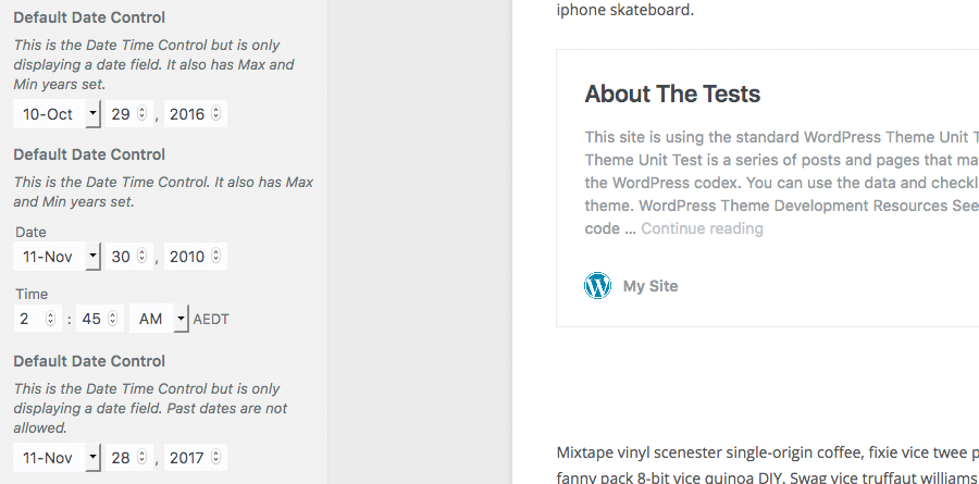
5.11 Date Time Control
Usage
add_control( $id, $args );
Parameters
$id – (string) (required) Customize Control object or ID of the Setting associated with this Control. Default: None
$args – (array) (optional) An associative array containing arguments for the setting. Default: empty array
Arguments for $args
label – Optional. The label that will be displayed Default: Blank
description – Optional. The description to display under the label. Default: Blank.
section – Required. The Section where there control should appear
include_time – Optional. Whether or not to display the time fields. Default: true.
allow_past_date – Optional. Whether or not the date field should allow past dates. Default: true.
twelve_hour_format – Optional. Whether the time should be displayed in 12hr or 24hr format. Default: true (i.e. 12hr format).
min_year – Optional. The minimum allowed year that can be selected. Default: 1000.
max_year – Optional. The maximum allowed year that can be selected. Default: 9999.
Example
$wp_customize->add_setting( 'sample_date_time',
	array(
		'default' => '2020-08-28 16:30:00',
		'transport' => 'refresh',
		'sanitize_callback' => 'skyrocket_date_time_sanitization'
	)
);

$wp_customize->add_control( new WP_Customize_Date_Time_Control( $wp_customize, 'sample_date_time',
	array(
		'label' => __( 'Default Date Control' ),
		'description' => esc_html__( 'This is the Date Time Control. It also has Max and Min years set.' ),
		'section' => 'default_controls_section',
		'include_time' => true, // Optional. Default: true
		'allow_past_date' => true, // Optional. Default: true
		'twelve_hour_format' => true, // Optional. Default: true
		'min_year' => '2010', // Optional. Default: 1000
		'max_year' => '2025' // Optional. Default: 9999
	)
) );
6. Data Sanitization
Whenever you're accepting data from users, the Number One rule is Trust Nobody. It's always important that you validate and/or sanitize your data, especially if this data is being saved back to your database.
Validate on Input, Escape on Output
Sanitization is the process of cleaning or filtering your input data. One of the easiest ways to sanitize your data is by using the built-in WordPress functions (read about validating data, sanitizing data & escaping data). As an example, there's functions like sanitize_email() for stripping out all invalid characters from an email address, and is_email() for performing a simple test to check that an email address is valid.

When adding your Customizer Settings there's two really usefully arguments that you can pass, validate_callback and sanitize_callback. You can use these to pass the name of the function that you want to use to validate or sanitize your control's data.
6.1 Sanitizing inputs
When using controls like input fields, the type of sanitizing is going to obviously depend on the type of data that your expecting. If you're expecting someone to enter an email address in your input field, for example, you'd sanitize this differently than if you were expecting straight alphanumeric text.
For a simple text field, you can use one of the built-in WordPress functions like wp_filter_nohtml_kses() which will strip all html from the content.
$wp_customize->add_setting( 'sample_default_text',
	array(
		'default' => __( 'This is some default text' ),
		'sanitize_callback' => 'wp_filter_nohtml_kses',
	)
);
For an input field where you're expecting an email address, you could use the sanitize_email() function that I mentioned above, which will strip out all characters that are not allowable in an email address.
$wp_customize->add_setting( 'sample_default_text',
	array(
		'default' => __( 'This is some default text' ),
		'sanitize_callback' => 'sanitize_email',
	)
);
6.2 Sanitizing checkboxes
Sanitizing a checkbox is quite easy. Since the checkbox value is either true or false (1 or 0), you simply need to return one of these values. A simple function can be written that tests if the checkbox has been set, and if so, it returns 1 otherwise it returns 0.
function mytheme_chkbox_sanitization( $input ) {
	if ( true === $input ) {
		return 1;
	} else {
		return 0;
	}
}
When creating the Setting for your Checkbox, pass the name of this function to the sanitize_callback argument.
$wp_customize->add_setting( 'sample_default_checkbox',
	array(
		'default' => 0,
		'sanitize_callback' => 'mytheme_chkbox_sanitization',
	)
);
7. Adding Controls to existing Sections
When adding your Settings and Controls to the Customizer, you might find that it makes more sense to add one or more to one of the existing Sections rather than creating your own section. This is allowed and even encouraged. As an example, if you're adding controls to allow customisation of your theme colours, it would make sense to add these controls to the default Colors section rather than creating your own section.
Adding Settings and Controls to existing sections is identical to adding Settings and Controls to your own Sections. The only difference is that for your section argument you'll use the ID's associated with these default core sections.
7.1 Adding a Select Control to the Header Image Section
$wp_customize->add_setting( 'my_new_header_image_select',
	array(
		'default' => __( 'center' ),
		'sanitize_callback' => 'sanitize_text_field',
	)
);
$wp_customize->add_control( 'my_new_header_image_select',
	array(
		'label' => __( 'Header Image Alignment' ),
		'section' => 'header_image',
		'type' => 'select',
		'choices' => array(
			'left' => 'Left',
			'center' => 'Center',
			'right' => 'Right',
		)
	)
);
7.2 Adding a Color Control to the Colors Section
$wp_customize->add_setting( 'my_new_font_color',
	array(
		'default' => '#333',
		'sanitize_callback' => 'sanitize_hex_color',
	)
);
$wp_customize->add_control( 'my_new_font_color',
	array(
		'label' => __( 'My New Color Control' ),
		'section' => 'colors',
		'type' => 'color',
	)
);
A list of all the default core sections and their associated ID's can be found in the Adding Panels Section, at the top of this post.
8. Refreshing the Preview
There are two ways in which you can update the preview window in the Customizer. You can refresh the whole page or you can perform a partial refresh, which is a refresh of just part of the page.
The type of refresh to use is set by the 'transport' argument when adding your setting. The default value is 'refresh', which is a whole page refresh. To perform a partial refresh, this value should be set to 'postMessage'.
Example
$wp_customize->add_setting( 'sample_default_text',
	array(
		'default' => '',
		'transport' => 'postMessage'
	)
);
8.1 Full Refresh
The default preview refresh in the Customizer is the full page refresh. This means that the whole preview window refreshes each time you change the value of one of your Controls. This refresh will only work if your theme actually makes use of your theme options. What I mean by this is, if you have a Customizer control that changes the colour of your text, as an example, then your theme must actually retrieve this value and make use of it (e.g. by changing the colour of the text). If you simply add a new control into the Customizer, but your theme isn't using that control's value, then the preview window will still refresh, but you'll see no visible change since you're not actually making use of that value.
Setting full page refresh
$wp_customize->add_setting( 'sample_default_text',
	array(
		'default' => '',
		'transport' => 'refresh'
	)
);
Since the default value for 'transport' is 'refresh' you don't even actually have to specify this argument. I've simply used it here for clarity.
When performing a Full Refresh instead of a Partial Refresh, your selector wont get an edit shortcut icon automatically added, like you do when performing a Partial Refresh. To get around this, you can also register a Partial for your Full Refresh (as explained in following section), but instead of specifying a function for 'render_callback' you simply pass it '__return_false' (e.g. 'render_callback' => '__return_false'). This will ensure your control gets an edit shortcut, just like when using the Partial Refresh option. Props to @Alanimus for providing this solution.
8.2 Partial Refresh
The preferred method of refreshing the preview window is by performing partial refreshes. This simply updates part of the preview window instead of reloading the whole page. This not only makes the refresh considerably quicker, it also looks significantly better as well, as only part of the page updates.
It's ok to fake it!
When refreshing the live preview window, using the partial refresh option in particular, it's ok to fake it. What I mean by this is that you may find it difficult to perform a partial refresh on the live preview, in the same way as you'd add the functionality for that option within your theme. This obviously depends on what you're trying to achieve, but to explain further, I'll give you a couple of examples;
A) I'm working on a theme where I have a Customizer checkbox control for displaying or hiding the Search functionality. If the checkbox is ticked, my theme will append a search icon to the main navigation menu. When looking at the site from the front-end, the theme will use the wp_nav_menu_items hook which allows you to filter the HTML list content for navigation menus. To append the search icon, I simply add a new list item. On the front-end, this hook is obviously run prior to the page being rendered so you can't perform a partial refresh in the same manner. To fake this functionality in the preview window, I simply use the jQuery append() function to append my list item to my main navigation list.
B) Another example where you might want to ‘fake it', is font styling, such as if you have a slider control for changing the font size of the page text. Basic HTML knowledge will tell you that to change the size of a font, you use font-size in your CSS document. To do this on the front-end of your site, you'd typically use the wp_head action hook to output your css within the <head></head> section of your rendered page. To fake this in the customizer preview window though, you can simply use the jQuery css() function to set the font-size of a particlar html tag (or class/id).
To use partial refreshes, you must set the 'transport' argument to 'postMessage' for each control where you want to use a partial refresh.
Setting partial refresh
$wp_customize->add_setting( 'sample_default_text',
	array(
		'default' => '',
		'transport' => 'postMessage'
	)
);
There are two ways in which you can perform partial refreshes. You can pass a PHP function, which will get called via AJAX, or you can use jQuery.
8.2.1 Partial Refresh using PHP & AJAX
To use a PHP function (via AJAX) to refresh your preview window, you need to first register a Partial.
Usage
add_partial( $id, $args );
Parameters
$id – (string) (required) The id of the Setting associated with this Control. Default: None
$args – (array) (required) An associative array containing arguments for the partial. Default: None
Arguments for $args
selector – Targets the element(s) in the page markup to be refreshed
container_inclusive – Optional. If true, a refresh replaces the entire container, otherwise it only replaces the container’s children. Default: false.
render_callback – Required. Produces the markup to be rendered on refresh.
fallback_refresh – Optional. Whether or not a full page refresh should occur if the partial is not found in the document. Default: true.
capability – Optional. Show or hide the control based on the user’s permission levels. Normally derived from the capabilities of the Setting.
Example
$wp_customize->selective_refresh->add_partial( 'social_urls',
	array(
		'selector' => '.social-header',
		'container_inclusive' => false,
		'render_callback' => function() {
			echo mytheme_get_social_media_icons();
		},
		'fallback_refresh' => true
	)
);
When you register a Partial using add_partial(), your selector will also receive an edit shortcut, which when clicked, will take the user directly to that section in the Customizer where they can edit that option.
8.2.2 Partial Refresh using jQuery
Partial refreshes can also be performed using jQuery. When you use jQuery, you don't actually have to register a Partial. You will need to enqueue your jQuery script though. To enqueue your script for use in the Customizer, use the customize_preview_init action hook.
function mytheme_customizer_preview_scripts() {
	wp_enqueue_script( 'mytheme-customizer-preview', trailingslashit( get_template_directory_uri() ) . 'js/customizer-preview.js', array( 'customize-preview', 'jquery' ) );
}
add_action( 'customize_preview_init', 'mytheme_customizer_preview_scripts' );
You will then need to bind your jQuery functions to the relevant controls that you wish to update. In the following example, I've specified the id of the setting that I want to refresh (search_menu_icon). This setting (and its associated control) is a checkbox. If the value of the control is true (i.e. the checkbox is ticked), it simply appends a new list item to the main navigation list. When the checkbox is unticked, it removes that list item.
jQuery( document ).ready(function($) {
   wp.customize('search_menu_icon', function(control) {
      control.bind(function( controlValue ) {
			if( controlValue == true ) {
				// If the switch is on, add the search icon
				$('.nav-menu').append('

<li class="menu-item menu-item-search"><a href="#" class="nav-search"><i class="fa fa-search"></i></a></li>


');
			}
			else {
				// If the switch is off, remove the search icon
				$('li.menu-item-search').remove();
			}
      });
   });
});
NOTE: If you find that your jQuery partial refresh doesn't seem to be working for some strange reason, make sure to clear your browsers cache and try again before tearing your hair out!
9. Retrieving Cutomizer Settings
After adding all your controls to the Customizer, you'll be wanting to use those values in your theme. To retrieve your customizer settings, use the get_theme_mod() function.
Usage
get_theme_mod( $id, $default );
Parameters
$id – (string) (required) The id of the Setting that you want to retrieve. Default: None
$default – (boolean | string) (optional) The default value to use if the Setting isn't found. Default: False
Example
<?php echo get_theme_mod( 'background_color', '#fff' ); ?>
This example will retrieve (and echo) the theme setting with the id background_color. If that setting doesn't exist, it will return #fff instead.
Summary
This should give you a basic understanding of how to create Customizer settings. In Part 2, I'm going to be showing you how you can go about creating your own Custom Controls for use in the Customizer. I'm also going to be introducing a number of Custom Controls that I've already built that you're able to take advantage of, such as Sliders, On/Off Switches and Repeaters, just to name a few.
To make it easier to integrate into your own projects, I'll also be including sample code, not just for the new Custom Controls, but for all the default Core Controls, as well as sample code for showing several ways to update the Live Preview window, so make sure you check it out.
See also: The WordPress Customizer – A Developers Guide (Part 2)
I’ve been grappling with the Customizer documentation and with the online tutorials I could find, for a couple of days now, and this is BY FAR the best !
It appears that most of the tuts written on Customizer were done in 2012 – 2014, and there were a few more recent developments, like the WP’s insistence on the sanitization, which are either glossed over, or not mentioned at all.
The ‘Theme Handbook’ is as opaque as it is arrogant, I totally agree.
Many thanks to Anthony.
Thanks for the kind words Zac. Glad you found this Customizer doco useful.
That was one of the things that I found annoying as well, and one of the reasons why I decided to write all this stuff up. There’s a number of tutorials around the place but they’re all 4 or 5 years old now and it’s changed a lot since then. And yes, the Theme Handbook documentation is an absolute joke. It doesn’t even mention most of the arguments that you can pass into functions like add_setting() or add_control(). They want people to get behind the Customizer, but haven’t done much in the way of making that easy for developers. Anyway, I could rant on all day about that! Cheers!
How can i add a edit shortcut icon (pencil icon) with Without selective refresh i.e. by using jQuery and PostMessage. As i am not able to find it. However the Post is fantastic. you have forgot to mention Kirki Plugin. I have the same issue using PostMessage i am not able to get the Shortcut icon. Does it only applicable for Selective refresh kindly clear my doubt.
I actually don’t know the answer to that, sorry. I haven’t been able to work that out myself and haven’t found any documentation on it. When I do though, I’ll update the post. As for Kirki, it’s a great plugin (& framework) for adding Customizer content, but these two guides are strictly about using the native core functionality, not third-party tools or frameworks.
Just further on this question, I’ve updated the Full Refresh section with the solution for this issue. Props to @Alanimus for providing this solution.