One of the first changes you'll probably notice when upgrading to Adobe Creative Suite 4 (CS4), is the use of tabs to display your windows. Previously, your windows “floated” within the CS4 interface. Now, they dock neatly up against the Options panel.
At first, it can take a little bit to get use to. The good thing though is that it's a simple change in your preferences to get your “floating windows” back. Simply “tick” or “untick” the checkbox in the relevant preferences dialog depending on whether you want your windows docked or not. Here's where you can find the options for the three main Creative Suite applications, Photoshop, Illustrator and InDesign.
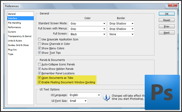
Photoshop
Select the “Edit > Preferences > Interface…” menu option.

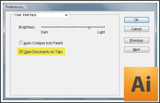
Illustrator
Select the “Edit > Preferences > User Interface…” menu option.

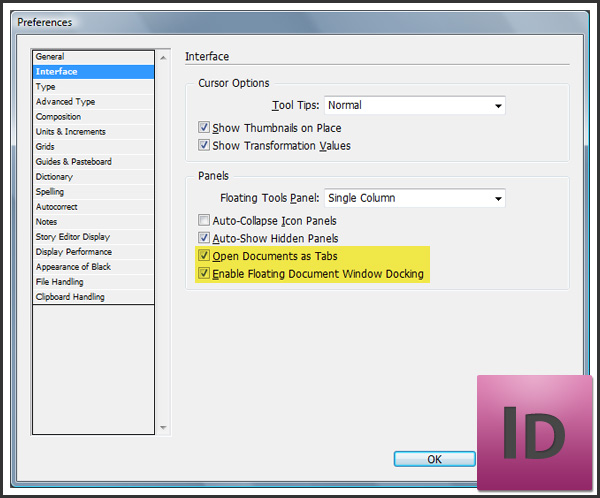
InDesign
Select the “Edit > Preferences > Interface…” menu option.

It's that easy! I hope you found this tip useful. I'd love to hear what you prefer so leave a comment. Me? I'm still undecided about the tabs. For the time being, I'll use them a little while longer 😉
Pingback: 10 Second Tip – Configure Your Document Tabs In CS4 | Adobe Tutorials